


Project Information
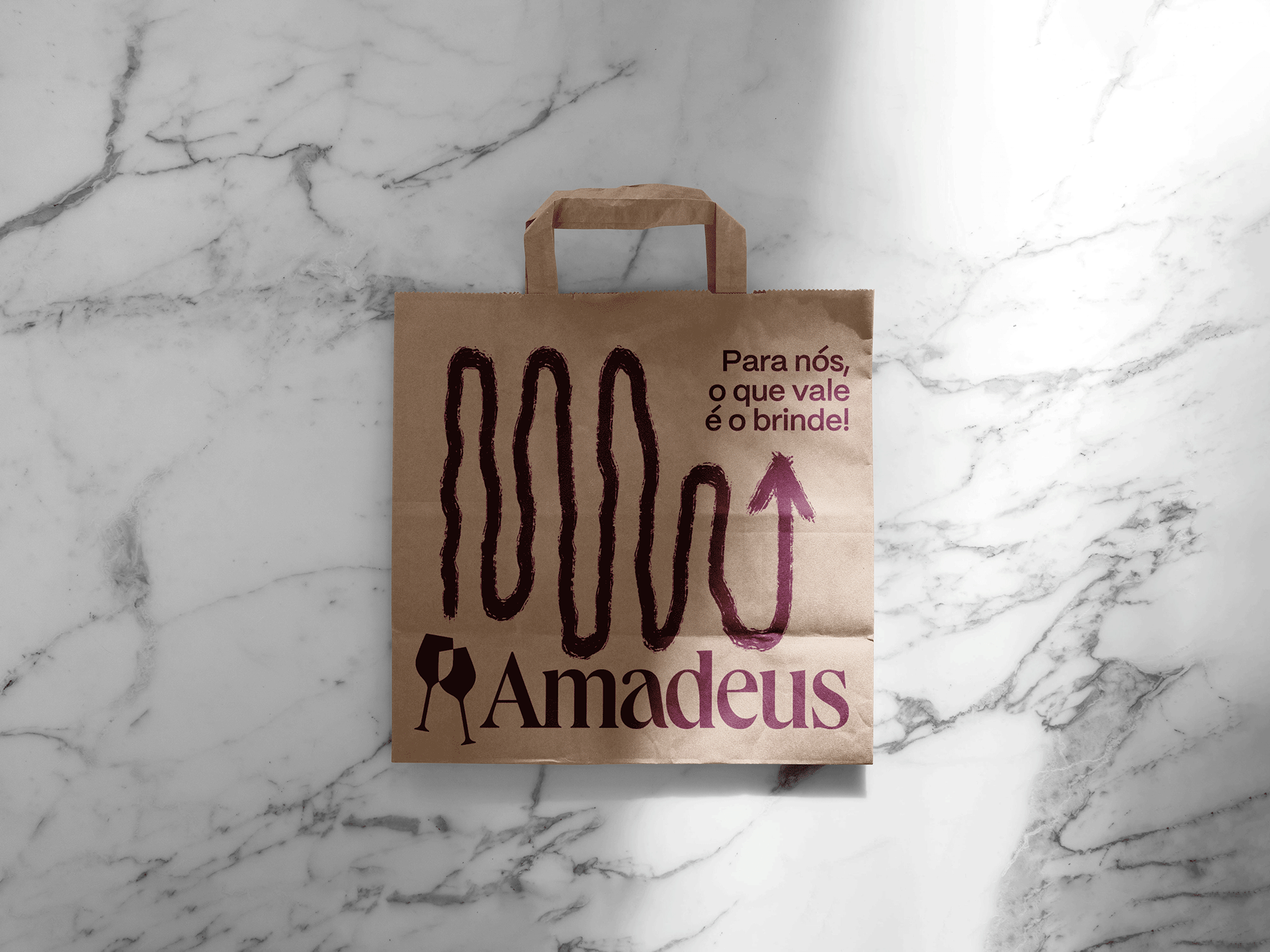
Amadeus is a distributor of domestic and imported wines focused on educating and deconstructing the world of wine for its customers.
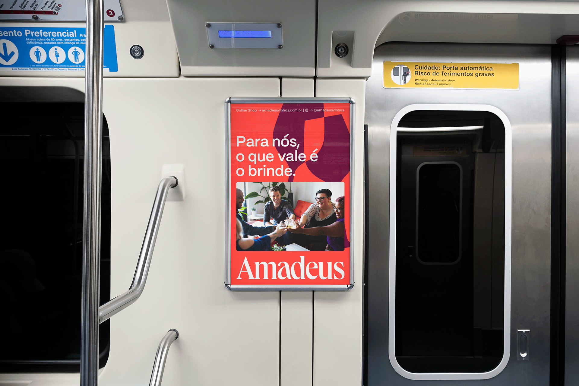
The main objective of the brand's positioning is the quality of the relationship, proper guidance and high-level treatment of its customers.
The proposal offered by the brand arose due to the saturated market of wine distributors with an exclusive focus on sales and a low level of customer relations and loyalty. This is a wine distributor where the brand goes far beyond its trade, prioritizes dealing with its customers and advocates the creation of an open community for wine lovers of any level of knowledge.
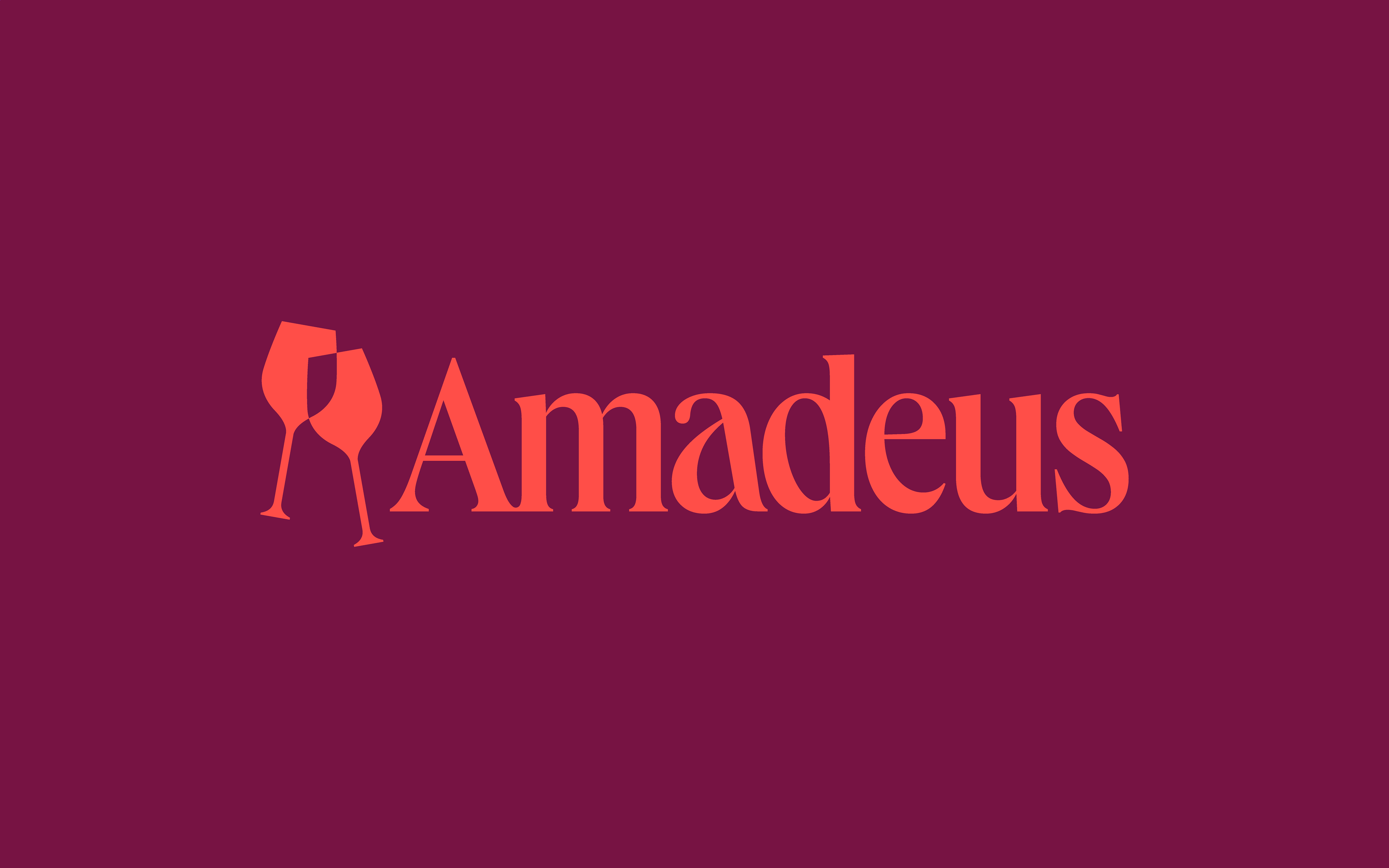
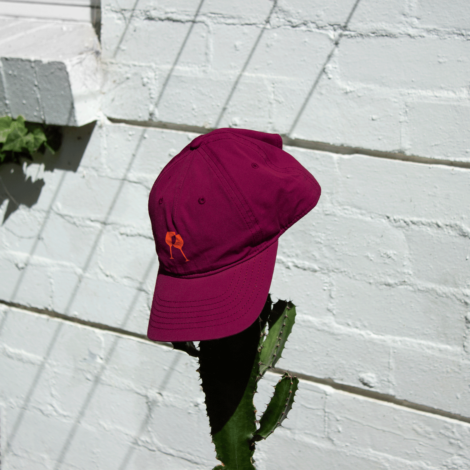
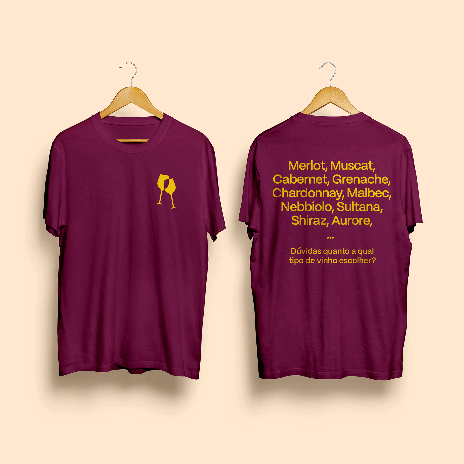
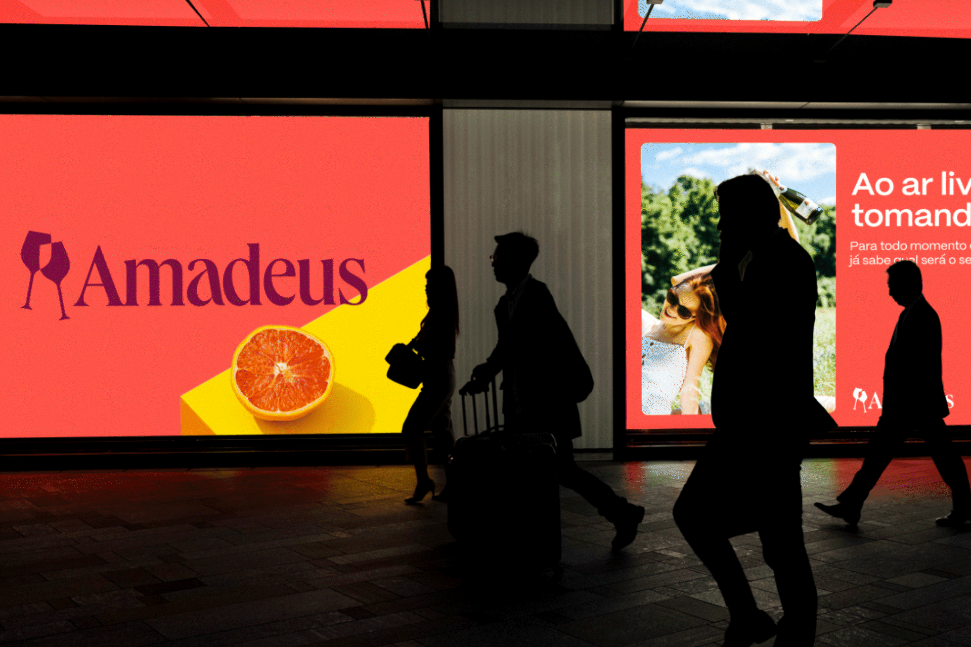
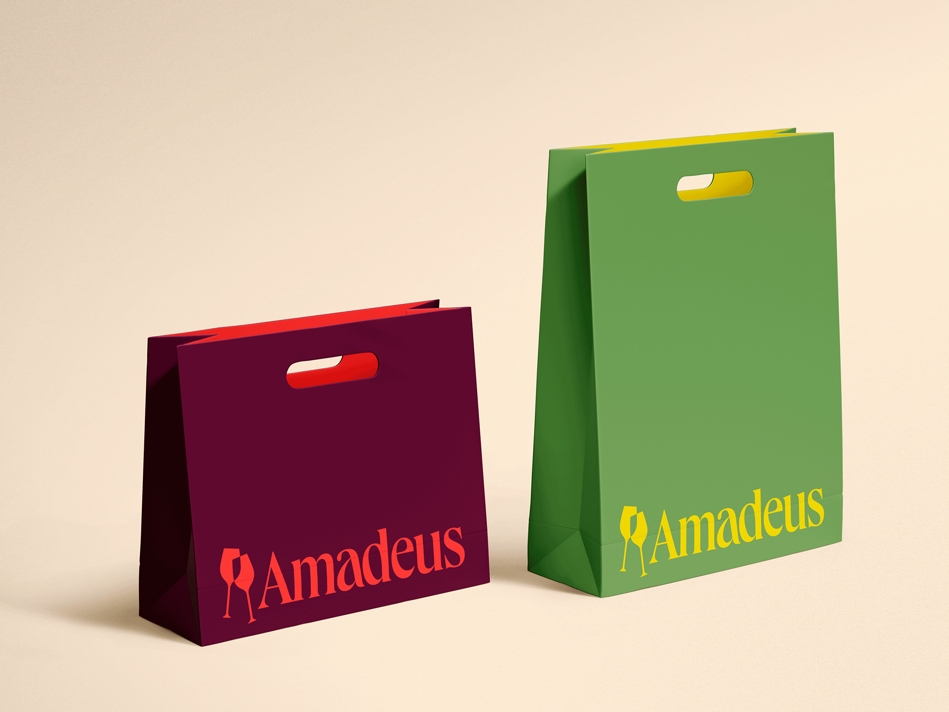
The symbol made up of wine glasses represents the act of toasting, symbolizing fraternization and the possibility of new experiences.
The brand's visual language was developed with the intention of conveying a receptive, refined but non-linear sensation. The brand's mission is also to deconstruct the idea that wine consumption belongs to a restricted group of people and occasions, showing that it can be enjoyed in a totally free and unpretentious way.
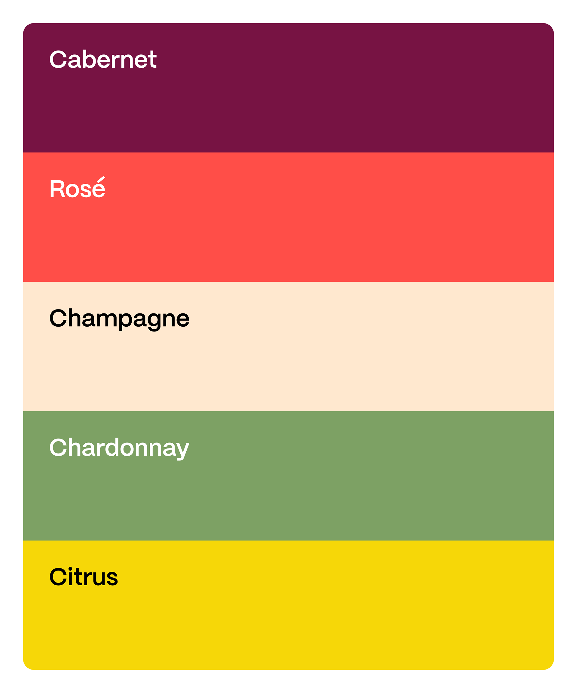
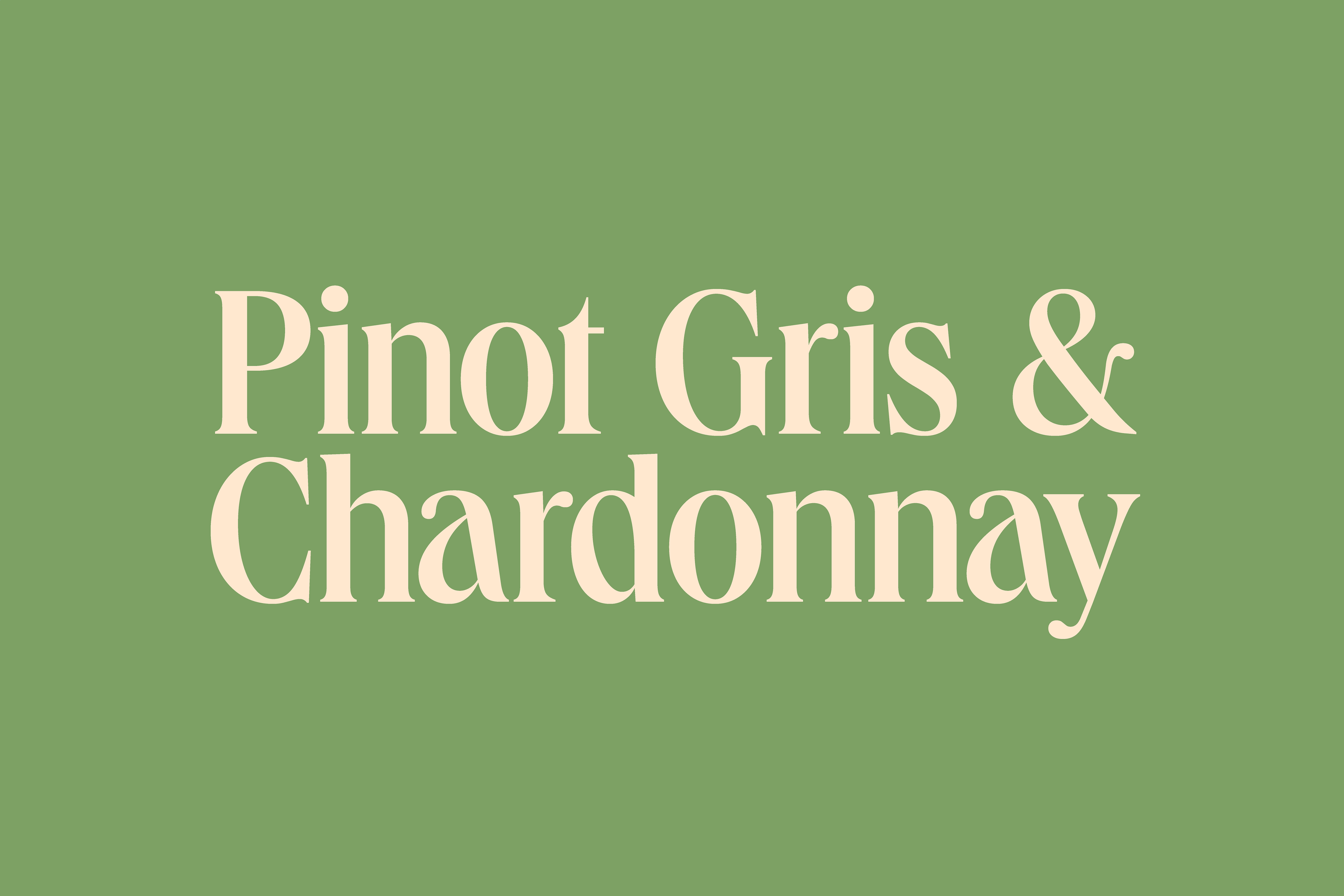
Vibrant colors and unique combinations like the different types of wine. A lean palette with several possible combinations, inspired by the colors and sensations of the different wine flavors and their particularities, such as Cabernet, Rosé and Chardonnay. A set that conveys an elegant, fresh, lively and unique sensation.
Credits
Creative Direction, Design, Strategy and Tone of Voice:
Enzo Graziano
Fonts
Acma - Pangram Pangram Foundry
Mori - Pangram Pangram Foundry