


Project Information
The Academic League of Reproductive Medicine of the Faculty of Medicine of the Pontifical Catholic University of Campinas was created with the aim of exploring topics related to human reproduction and fertility, subjects that are little visited by Brazilian medical schools.
Another aim of the initiative is to provide students with access to theoretical knowledge with a broad area of research and advancement, through the introduction of high-level technical laboratory procedures.
The curriculum consists of classes in different areas of health, such as gynecology and obstetrics, urology, pediatrics, clinical medicine, surgical practice and psychology. In addition to these specialties, the group will discuss topics such as the development of interpersonal skills and address sociological issues of family planning.
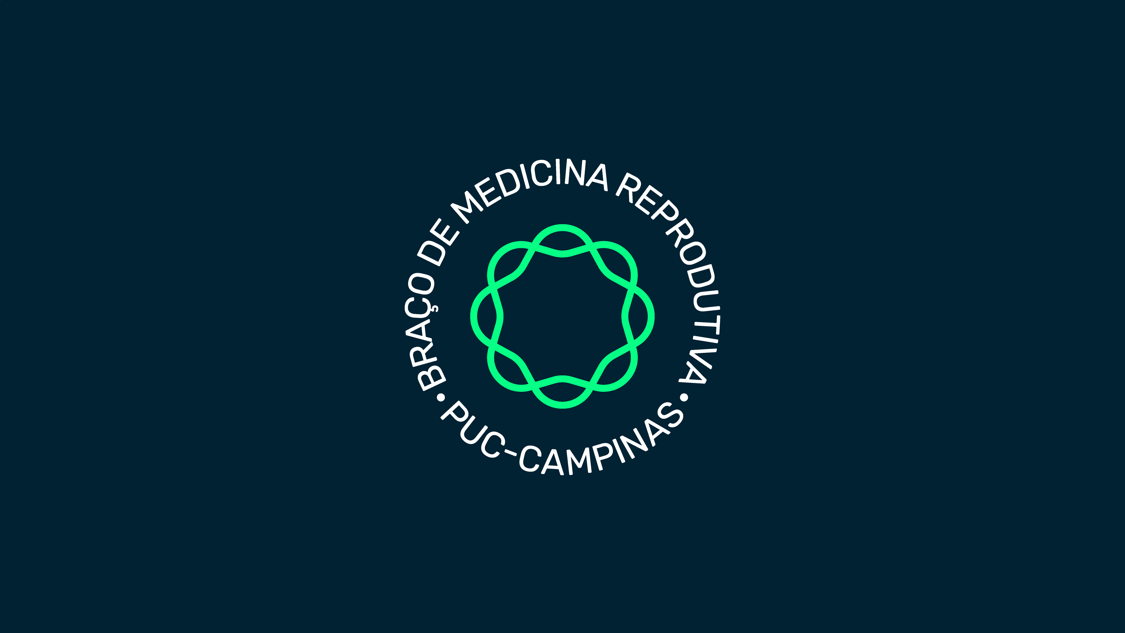
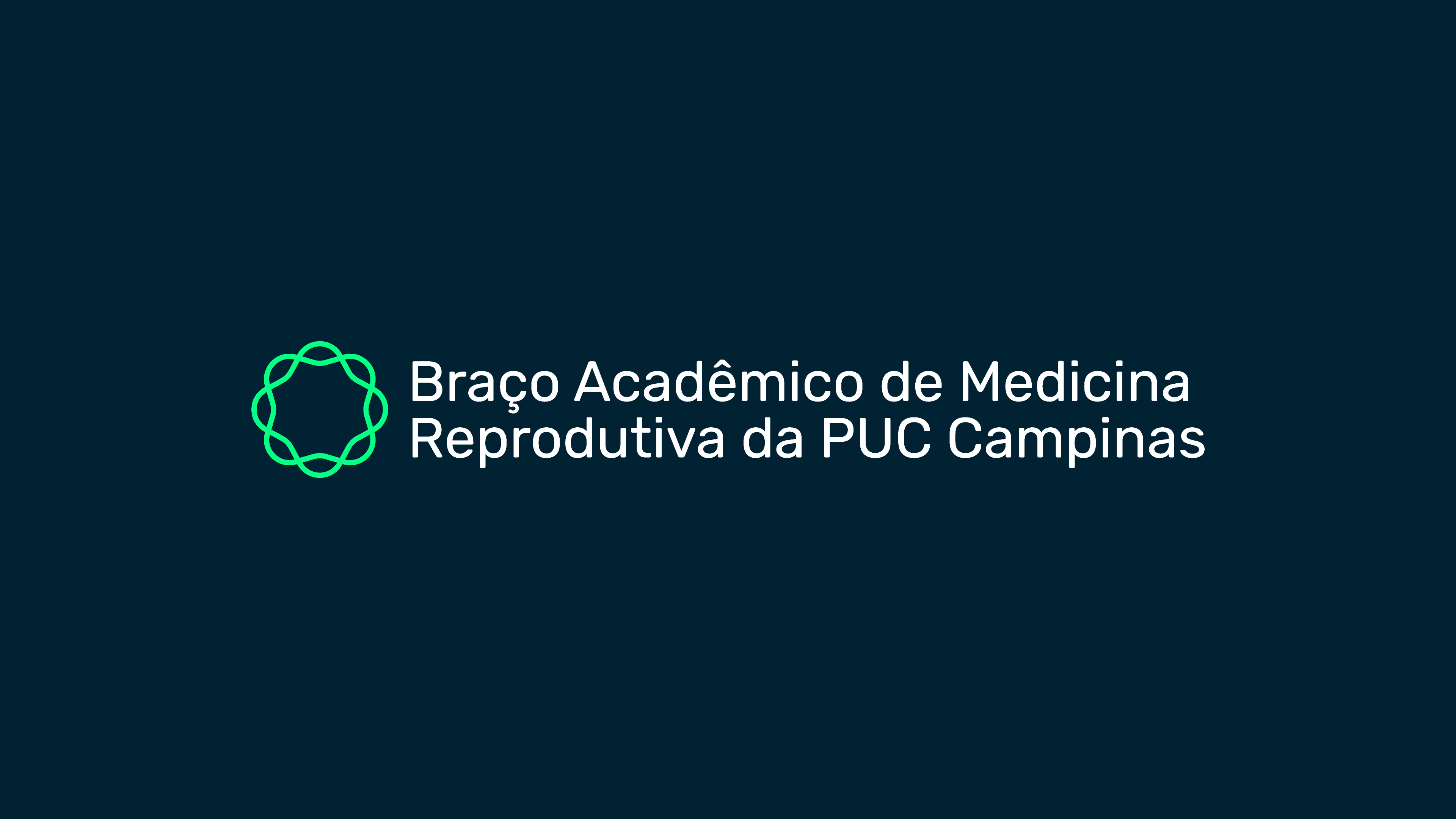
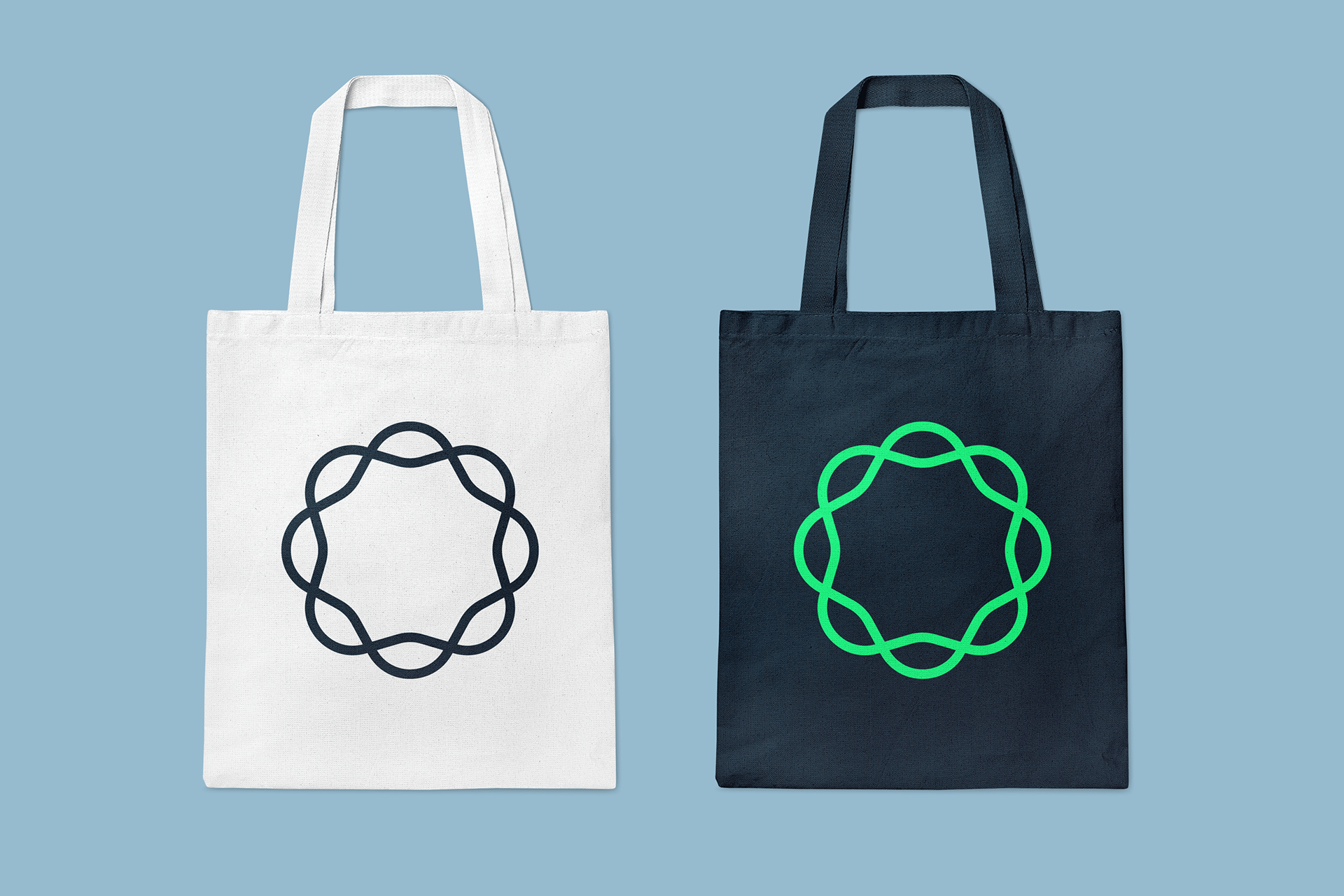
The logo was defined by the importance of the field of study of reproductive medicine as a contributor to the emergence of life. In this case, it was decided to represent this emergence as a cycle, briefly mentioning the drawing of a cell and referring to the intertwined form of a DNA chain, which also represents the various intersections of medical specialties in the formation of this area. The focus was on proposing a simple logo that referred to the academic field and not to a clinic or health body and, finally, in such a way as to avoid depicting figures of pregnant women, fetuses, spermatozoa or any saturated symbol in this area.
Limitation as fuel for creativity
The aim of the project was to develop a visual identity made up of simple and easily reproducible elements, since the creative team responsible for continuing the project would be made up entirely of medical students.
Thinking about the limitations that a team from a completely different area could face acted as a catalyst for creativity in search of solutions that suited them.
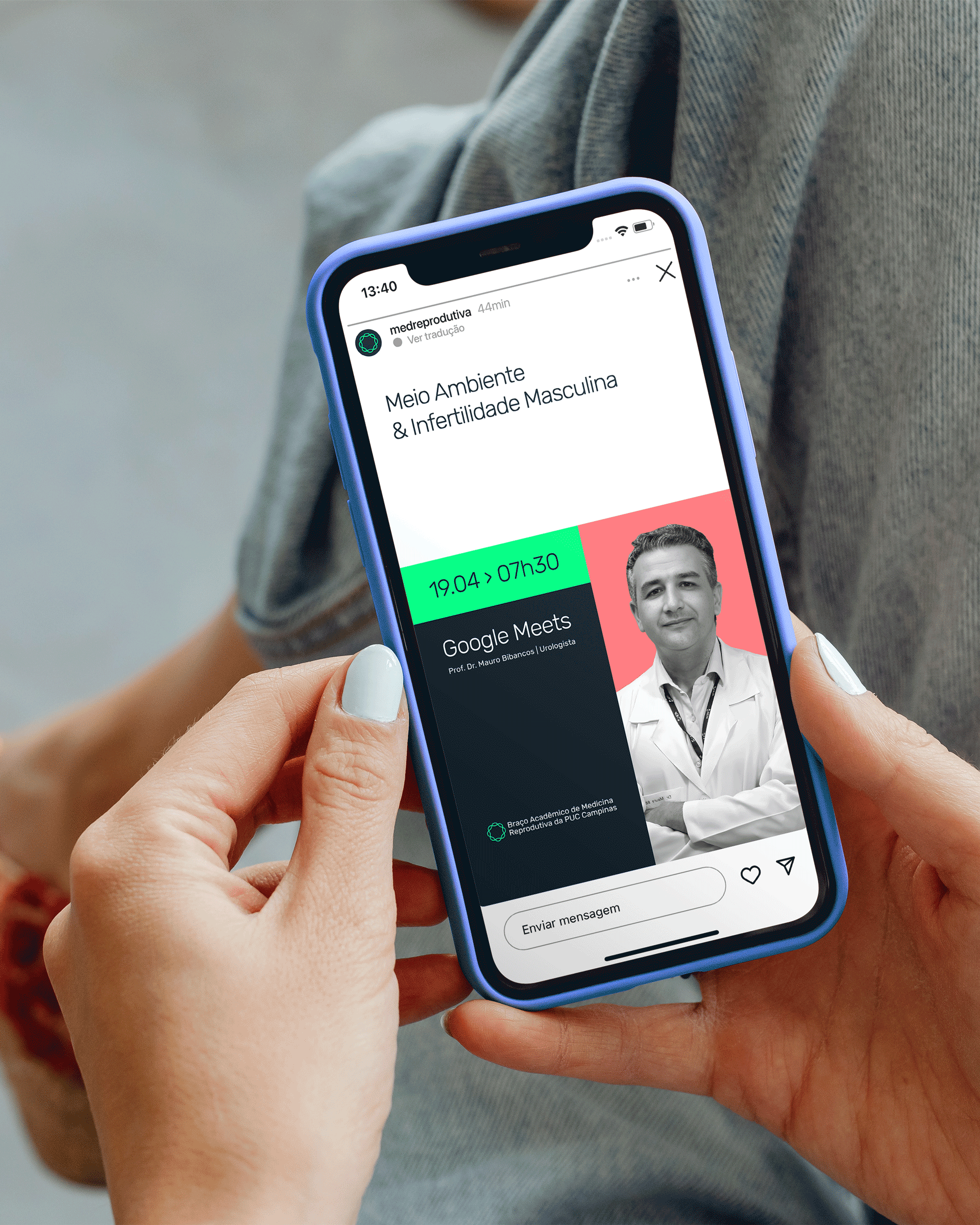
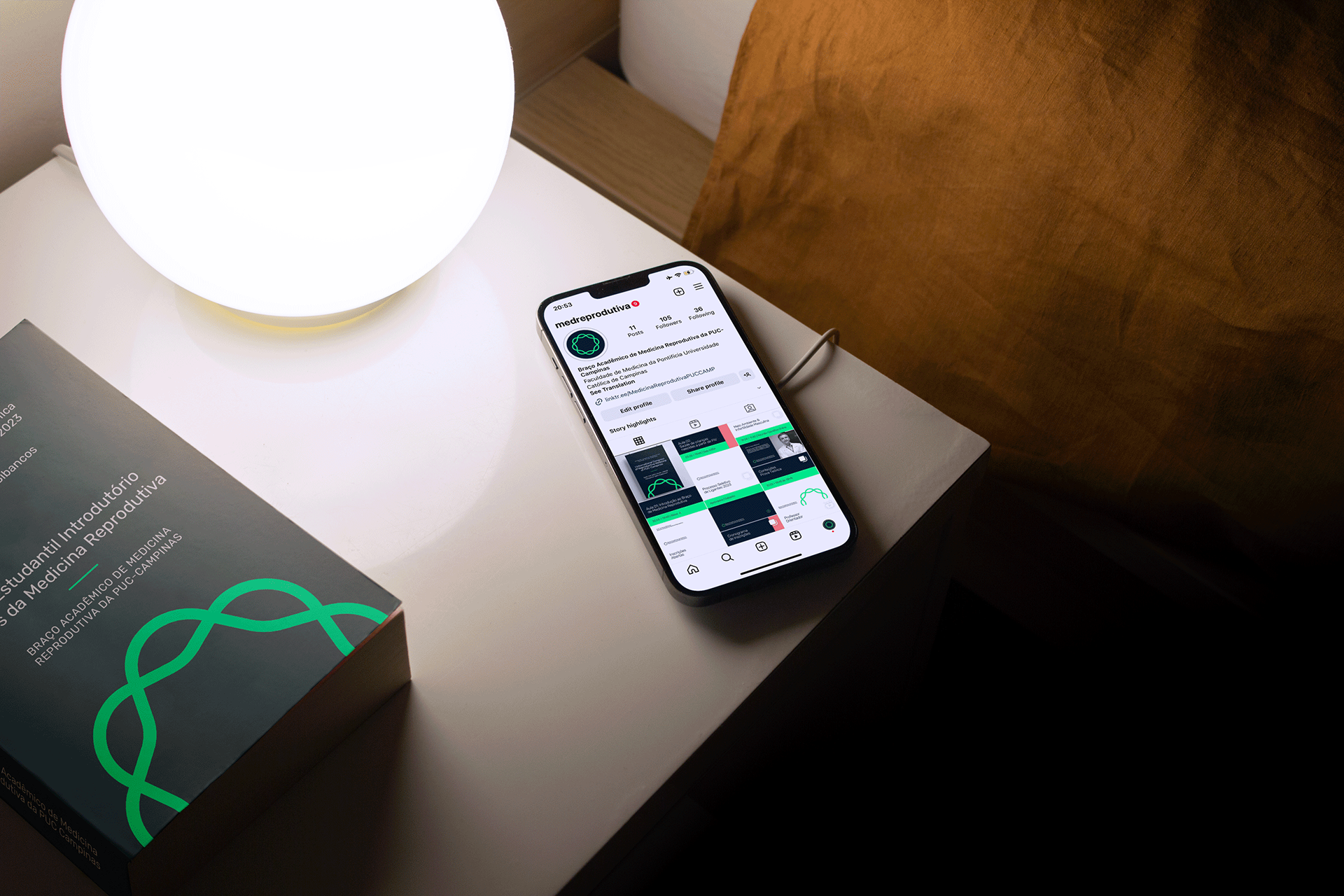
With this in mind, models were developed consisting of basic, fully adjustable grids, like a puzzle, which are simple but cover a large number of possibilities. These models work with the idea of simple proportions such as half, a third, a quarter - and so on - of the total size of the pole.
Another carefully chosen point was the font family that would be used, in this case Rubik suits the project due to its comfortable shape for reading, headings and composing presentation slides. A free font family available for Canva without the need to install any files, so none of the students responsible for the project would have any trouble using it.
Putting the project identity into practice
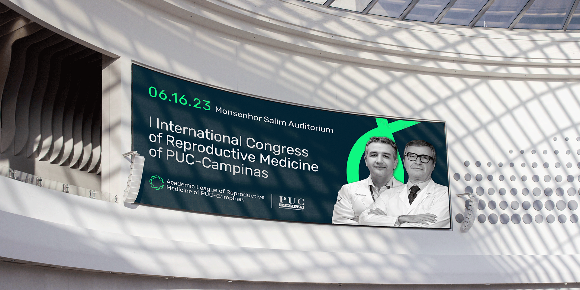
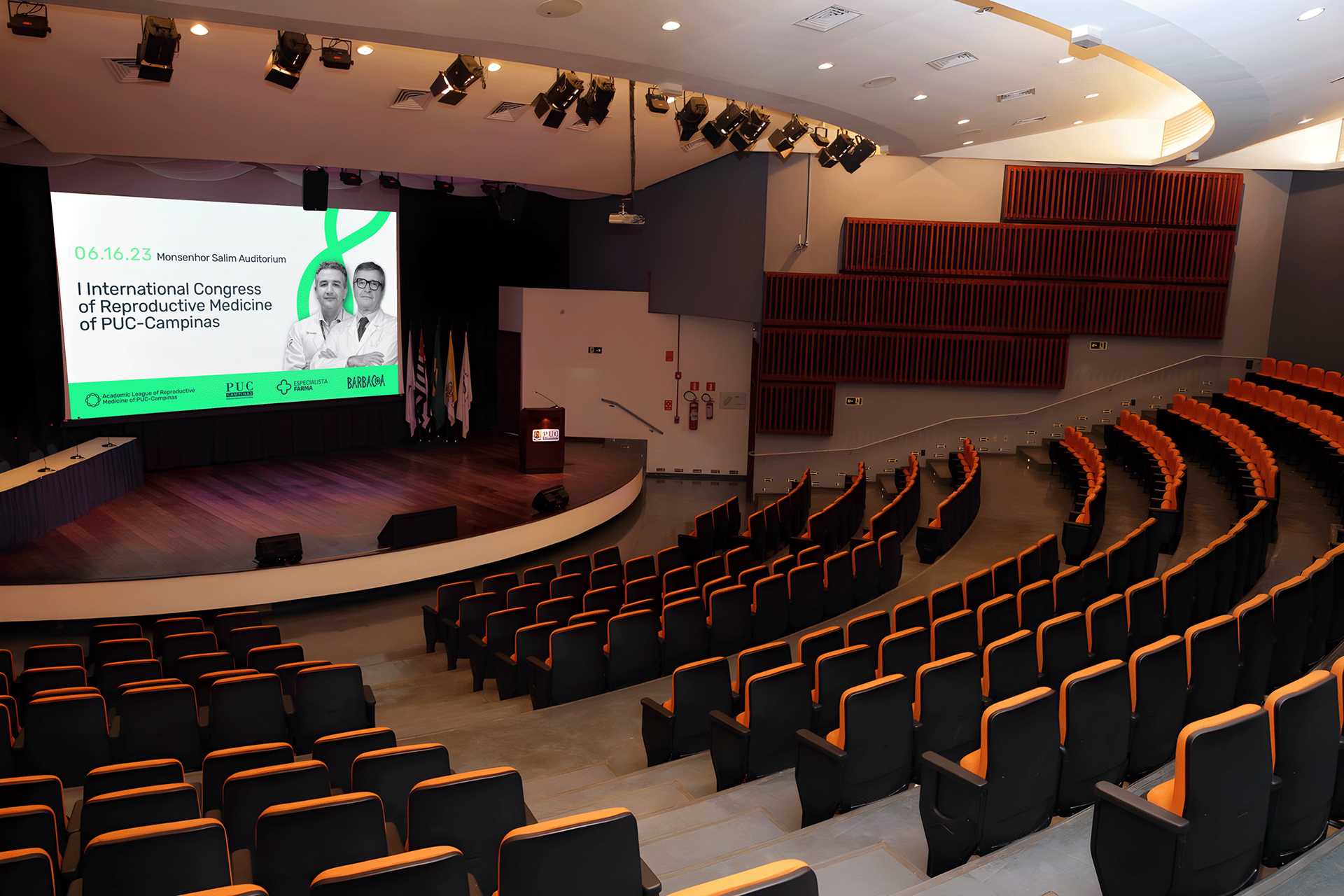
The league's identity was put to the test at its first international congress, the 1st International Congress of Reproductive Medicine at PUC-Campinas, which welcomed foreign experts in the field of reproduction. The event was extremely important for the league in its construction in the medical academic field and was held in the Monsenhor Salim auditorium at PUC-Campinas in partnership with the university itself.
Credits
Creative Direction, Design, Strategy:
Enzo Graziano
Font
Rubik - Hubert & Fischer