


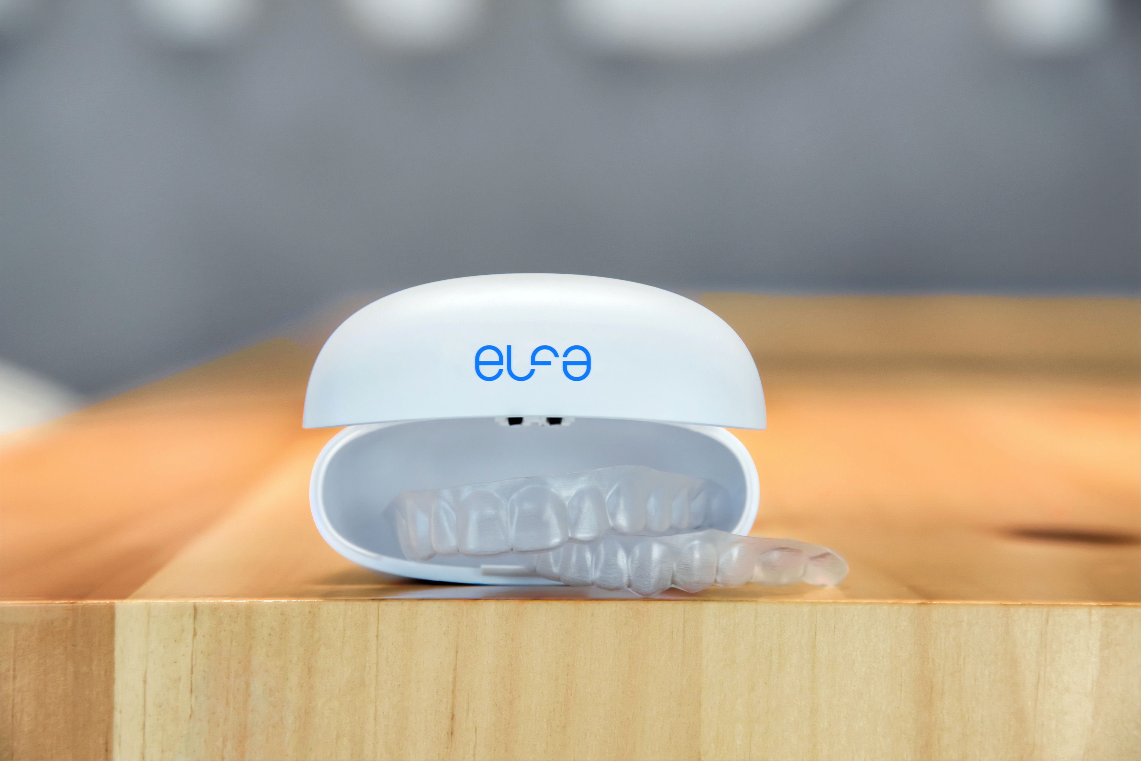
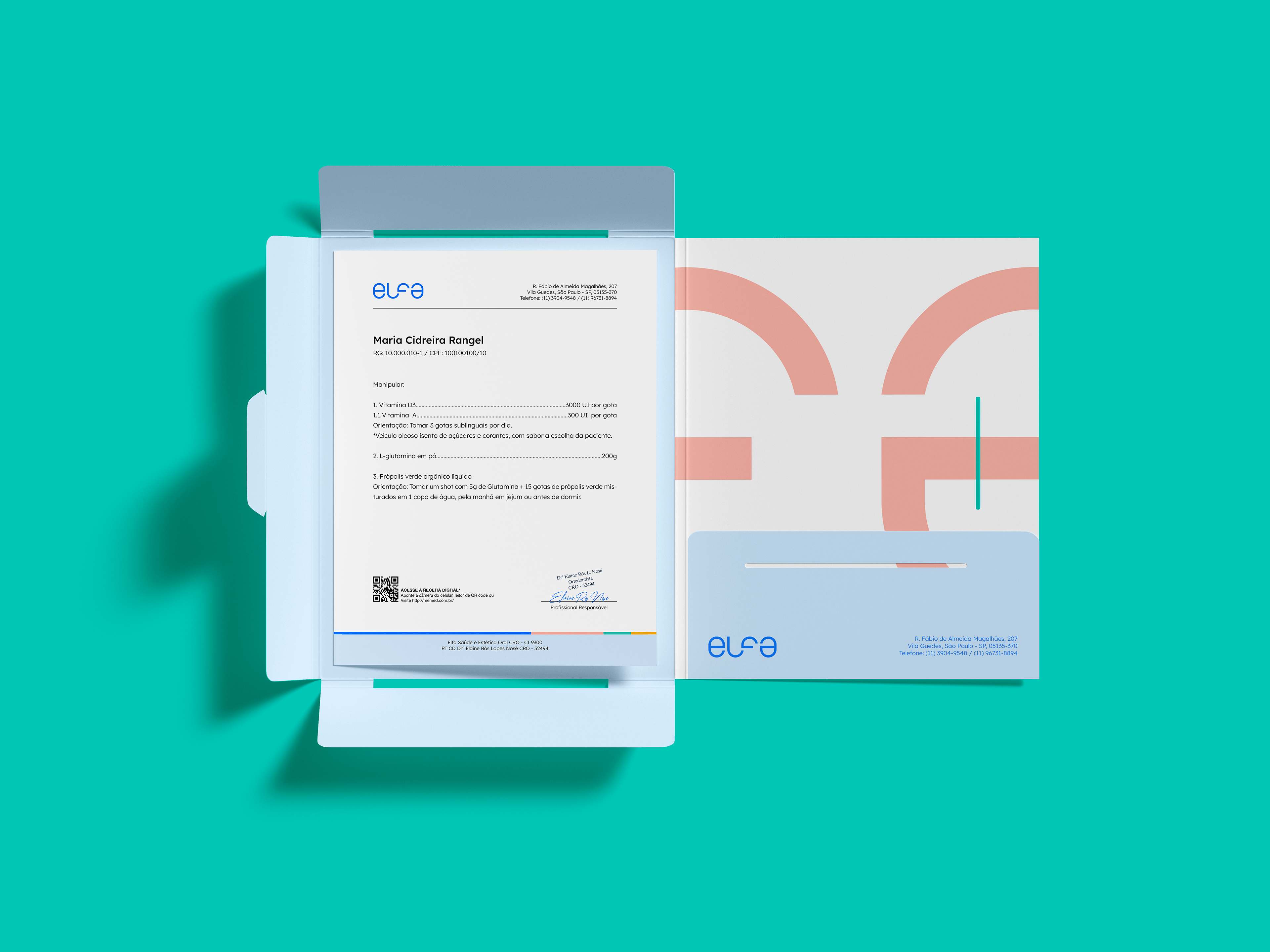


Elfa is a comfortable, affordable and modern dental clinic located in São Paulo, Brazil.
The clinic have been operating in the market for a little over a decade, the desire to update its identity and make it as timeless as possible.
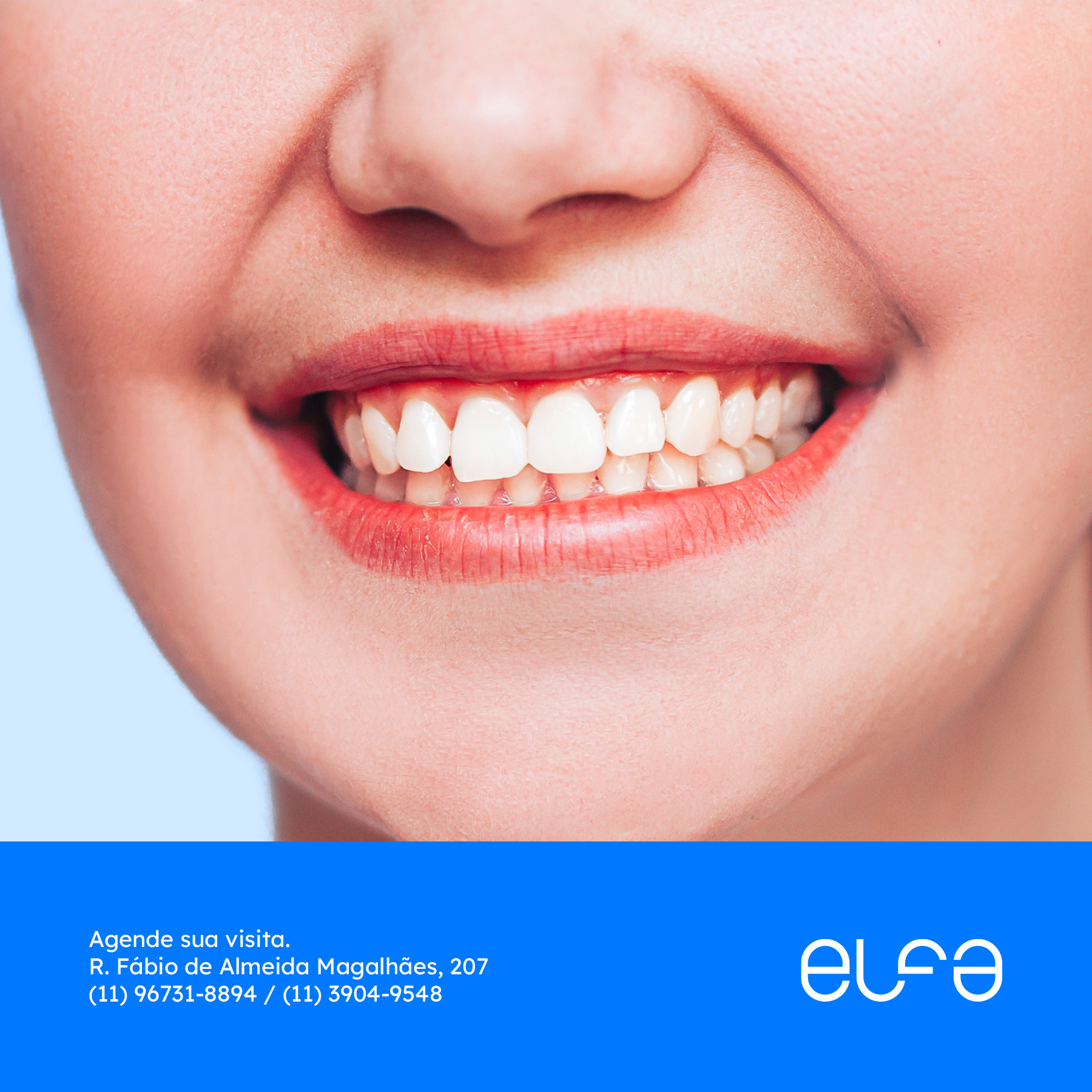
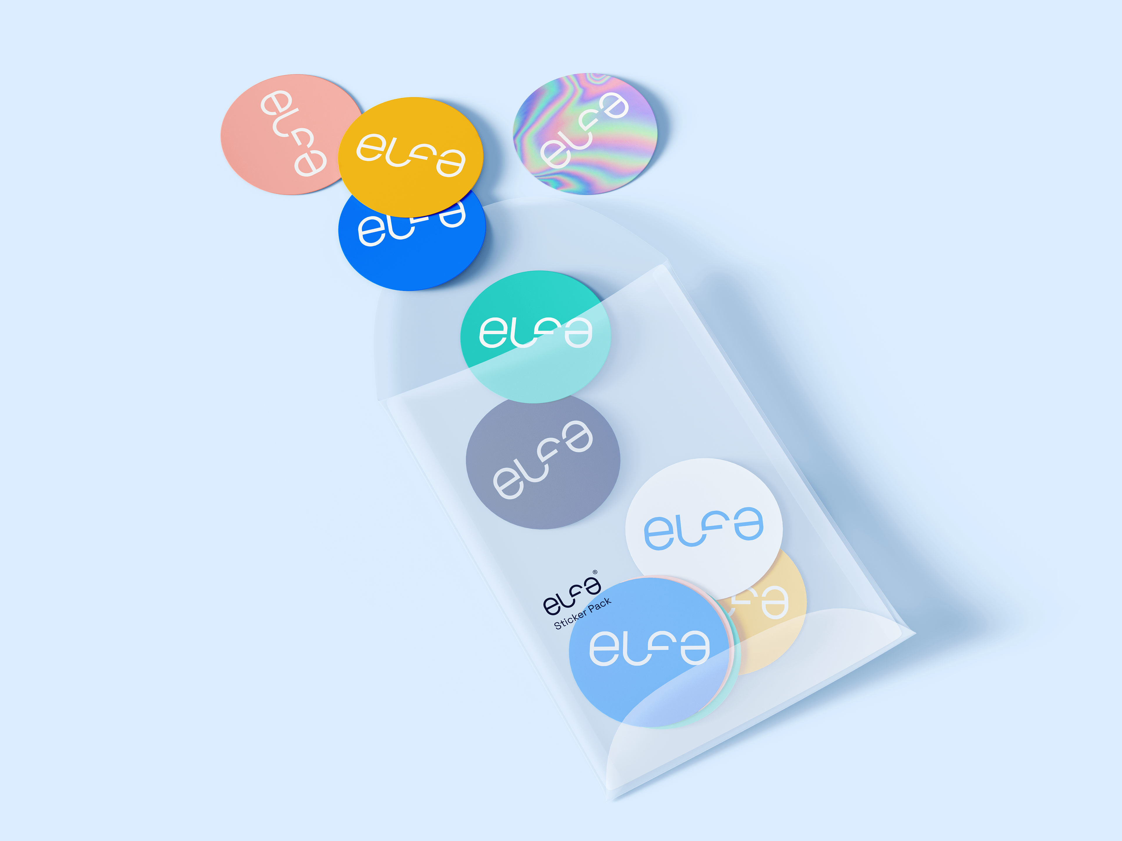
Elfa has a wide range of clients, from caring for families with children and young people to older patients. Such a variety of age, gender and user needs motivated the creation of a plural and welcoming visual identity, which could better accommodate everyone.
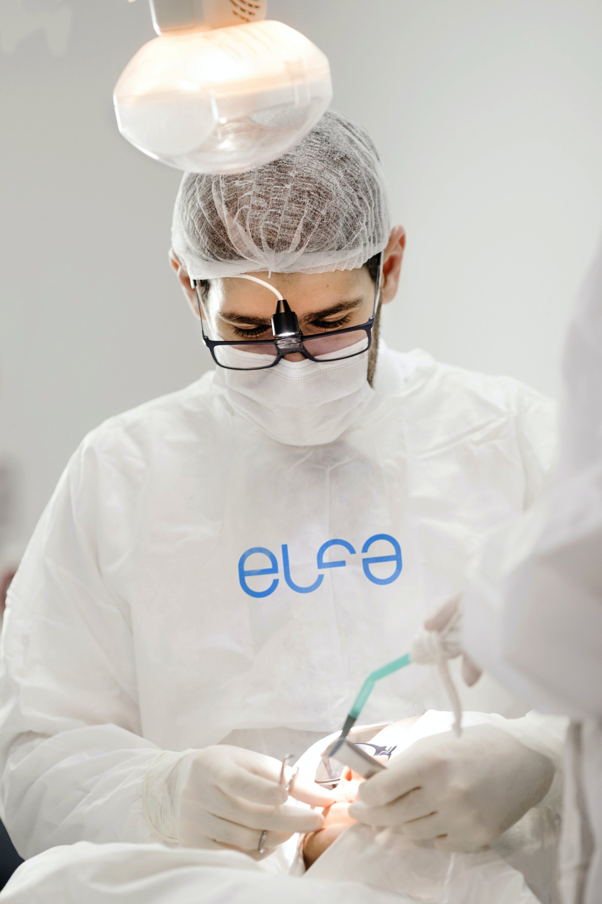
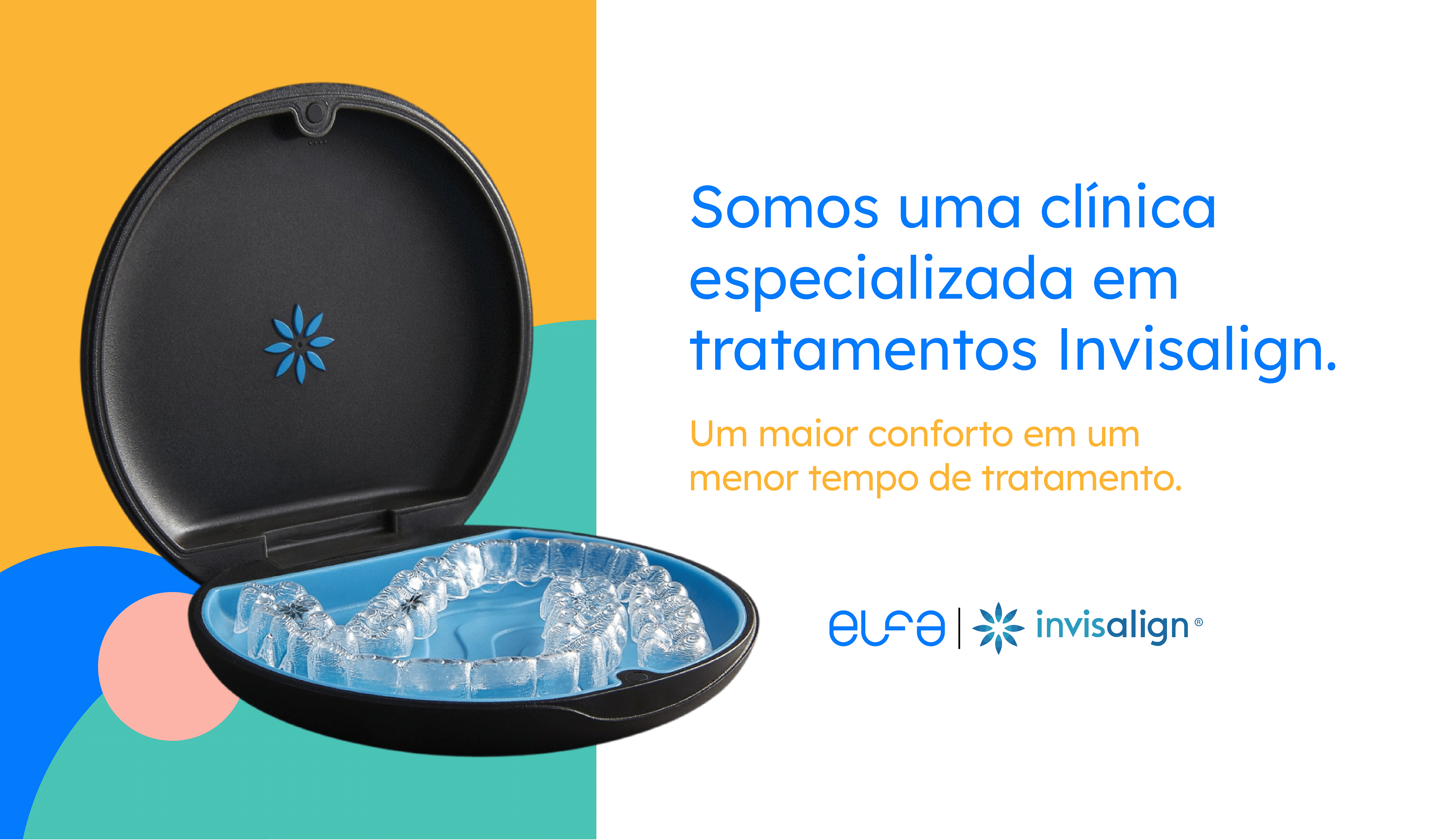
In its last years of operation, there was a large investment in equipment, materials and infrastructure for the clinic. Therefore, a new logo was developed, to convey credibility, consistency for future dental symposia in which they will participate and modern as well as the service itself.
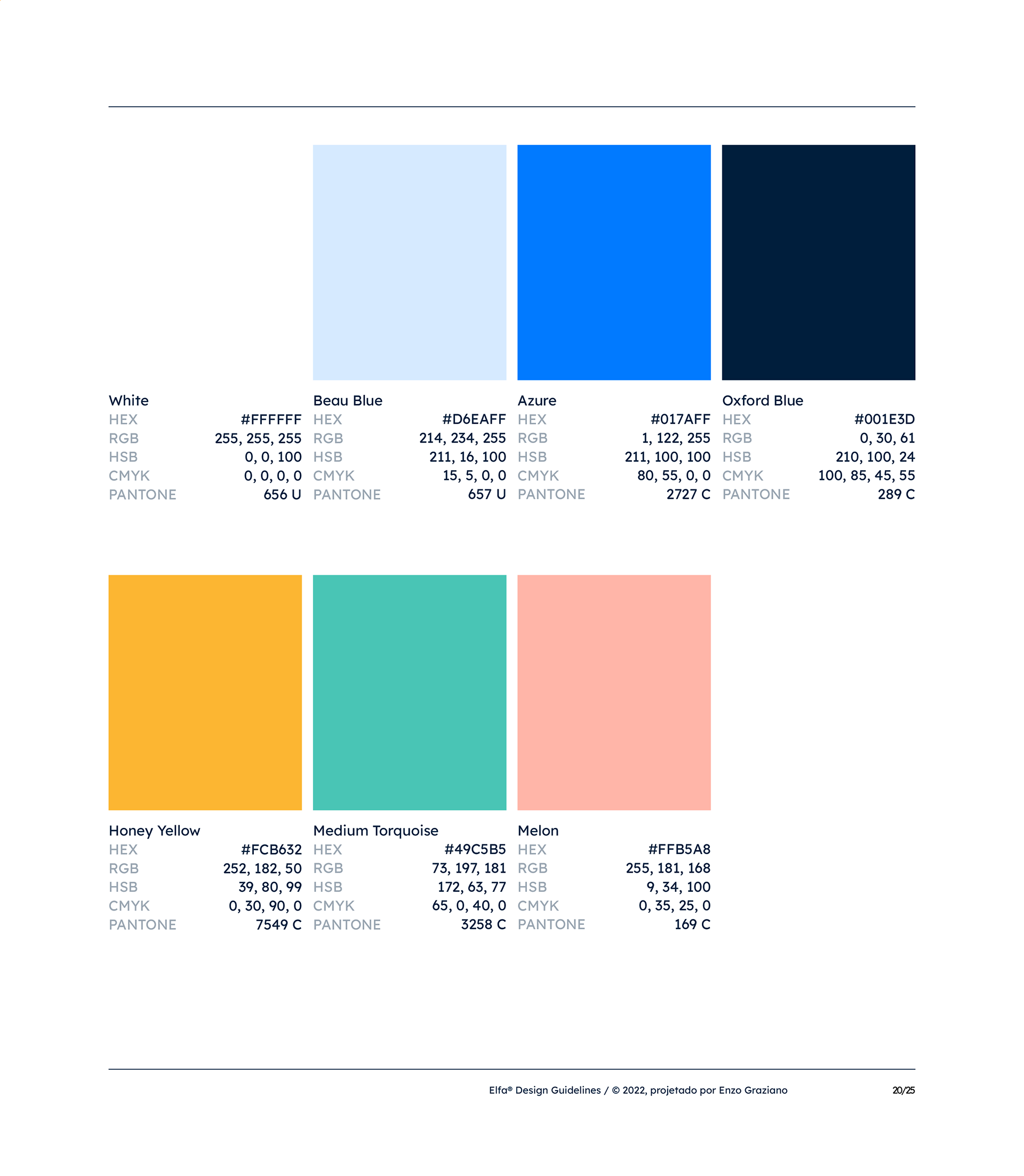
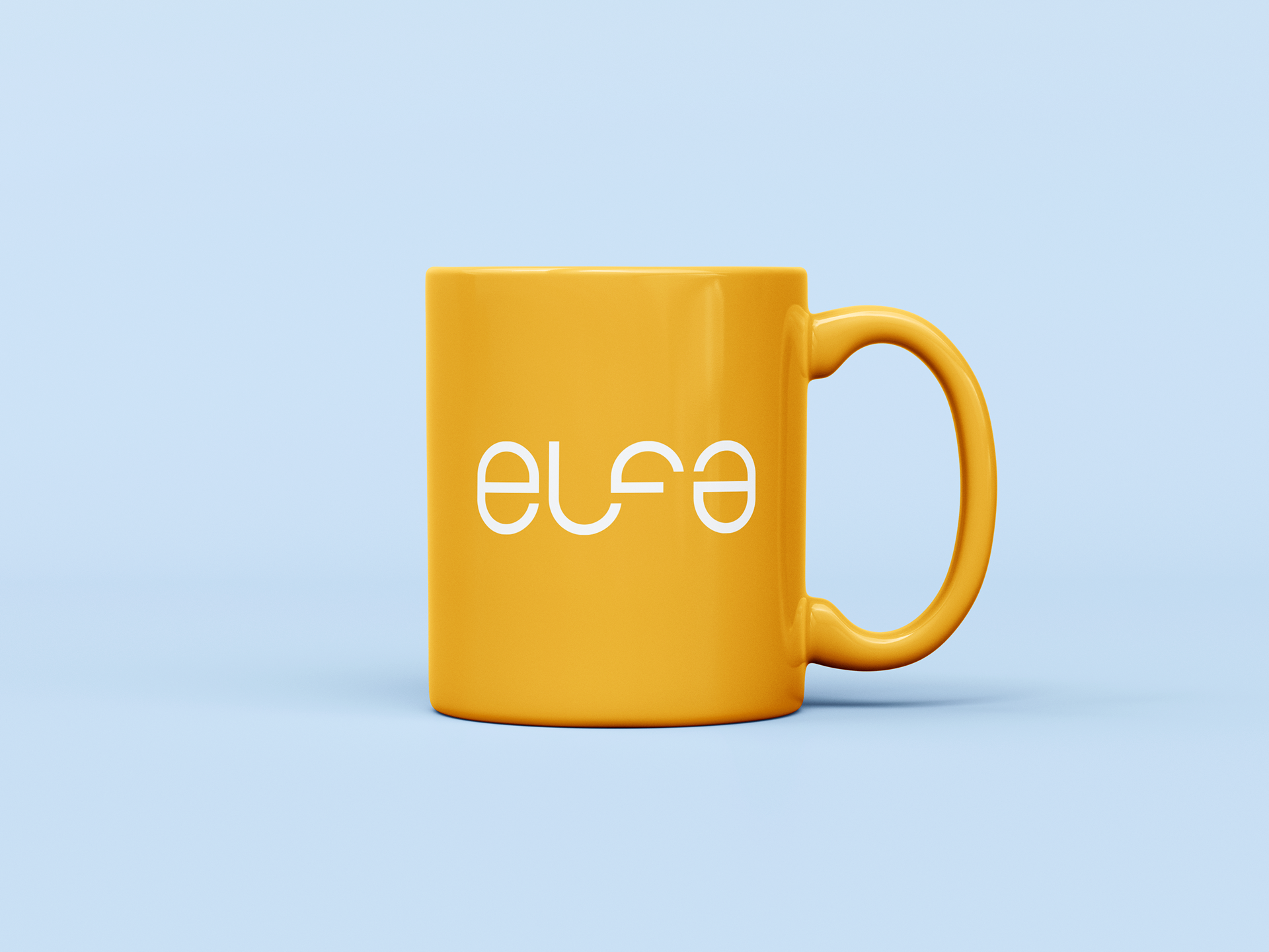
The diversity of colors against the monotonicity and coldness of the conventional hospital clinical environment.
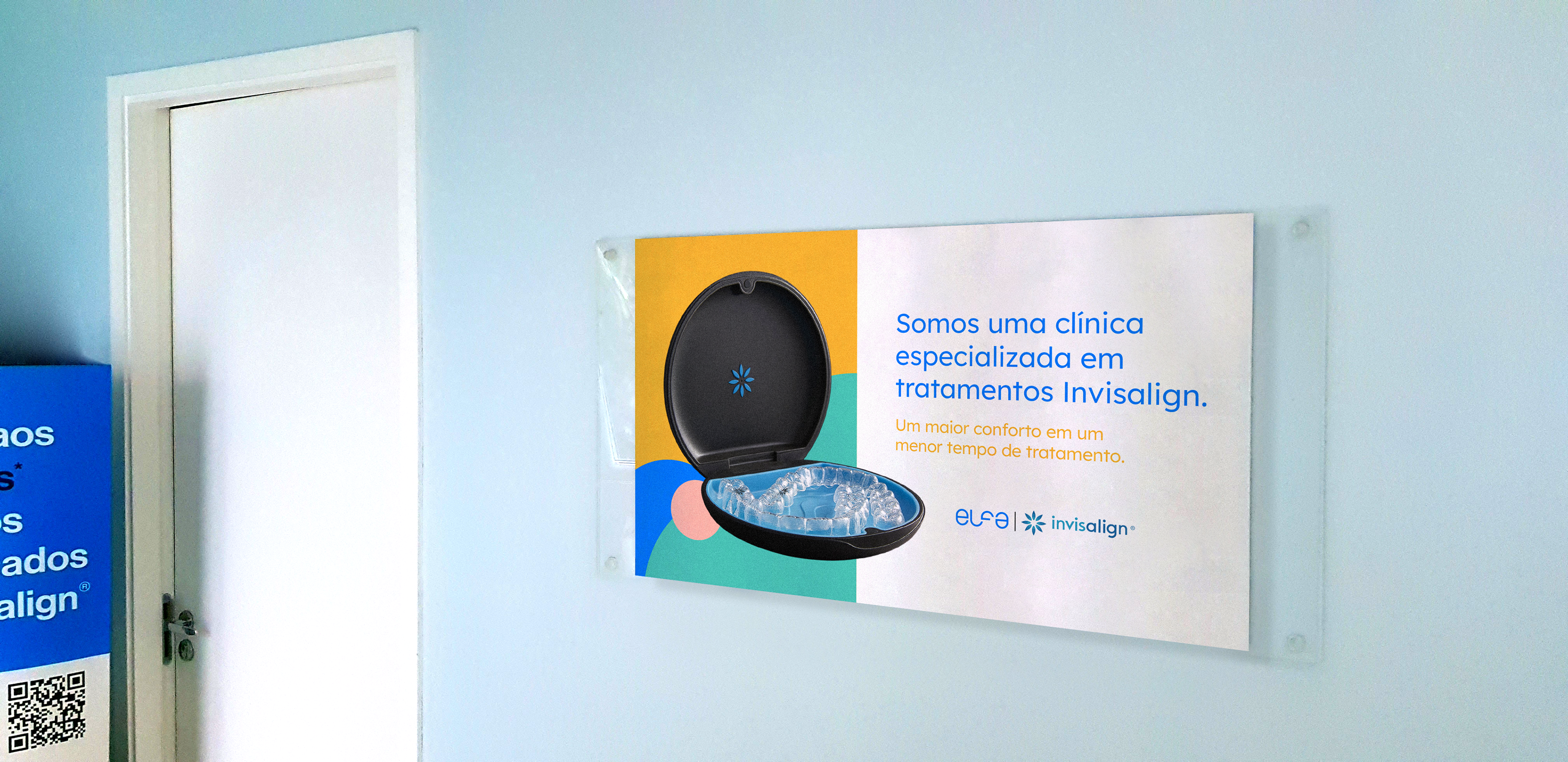
One of the most discussed points throughout the project was the possibility of creating a clinical space without the cliché of the hospital environment. The challenge was to fight white and too much cold tones, in order to bring a new vision to the patient showing that a clinical environment does not have to be uncomfortable, distressing and tedious.
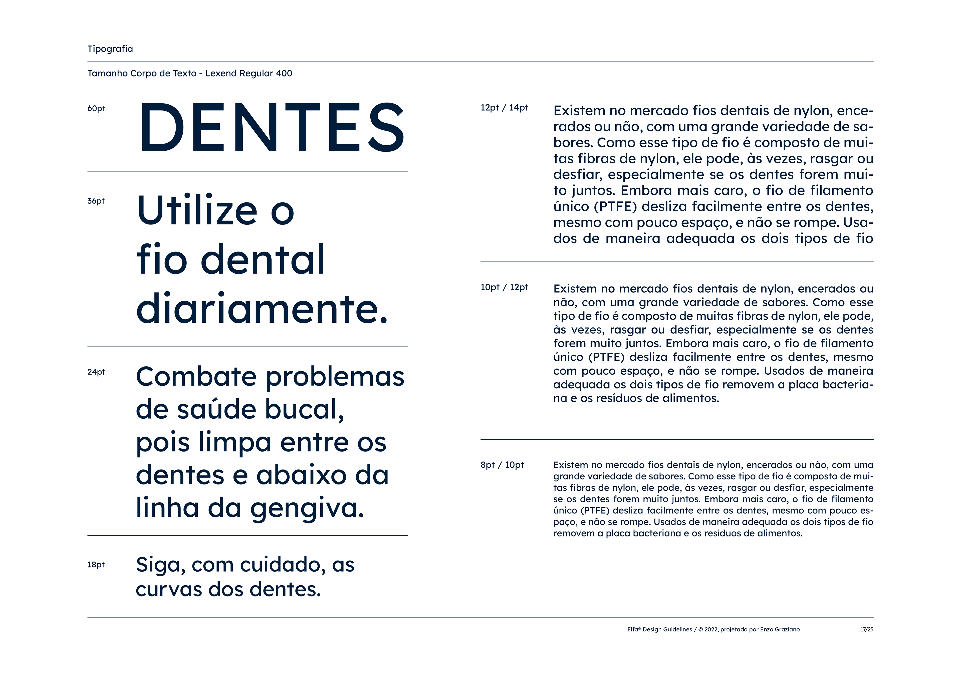
Lexend, a variable font empirically shown to significantly improve reading-proficiency.
Lexend fonts are intended to reduce visual stress and thus improve reading performance.
This font family was chosen to compose Elfa's new identity manual given the plurality of the public that frequents it. Therefore, the font must be suitable for each and every patient in the clinic.