


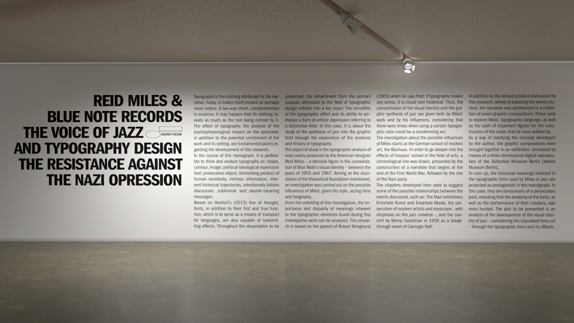


This graphic design thesis presents a typographic analysis of the vinyl covers produced by the American designer Reid Miles, during the period he worked for Blue Note Records (1955-1967).
Given this historical cut, the research defends Miles’ work as the graphic synthesis of jazz, focusing on his production of covers created through the manipulation of his typographic arsenal. The analysis seeks to understand the construction of the visual identity of the musical genre, drawing connections through its possible historical influences, composition patterns and meaning of the sources used.
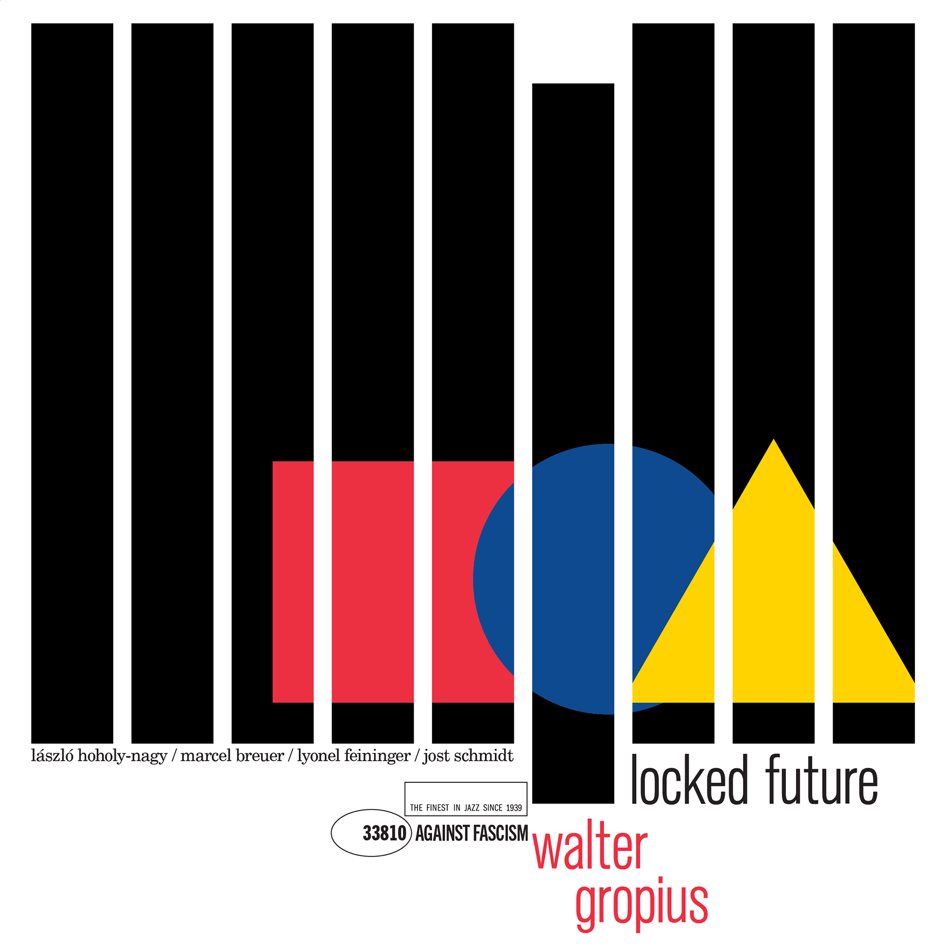
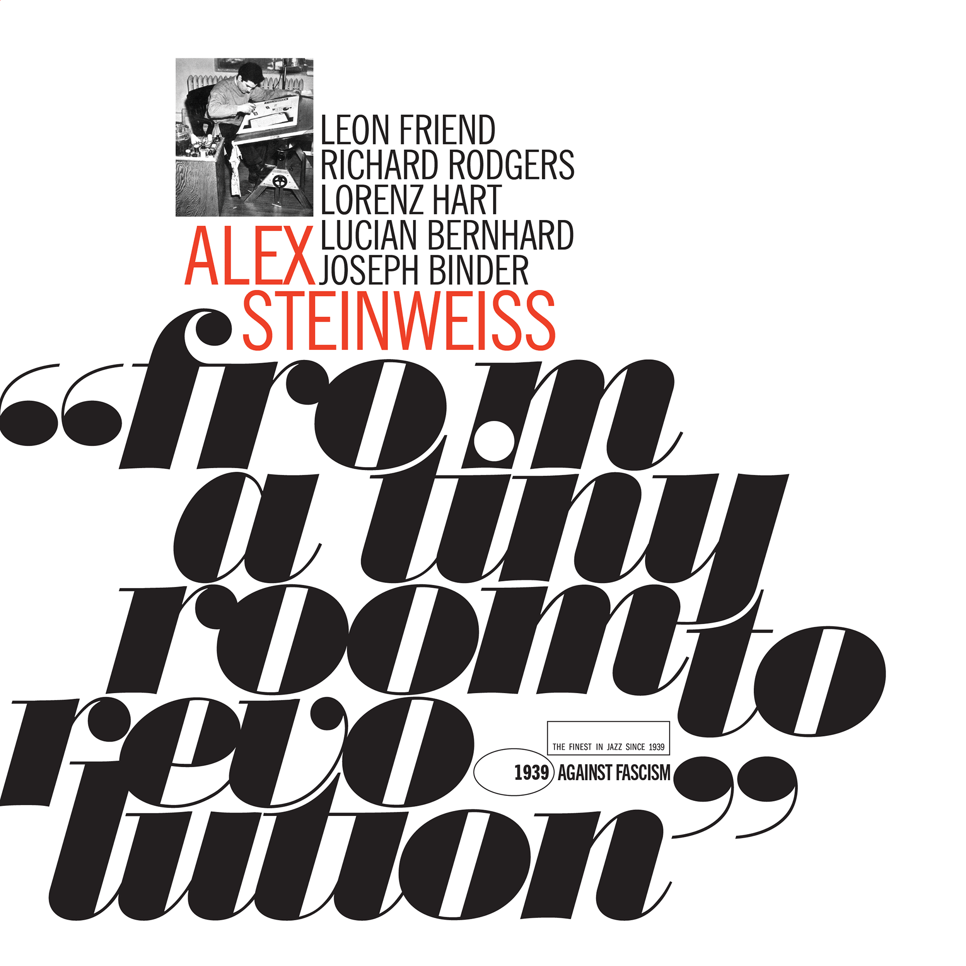
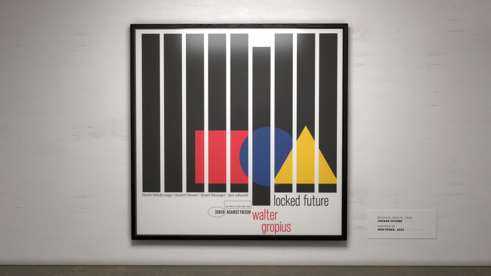
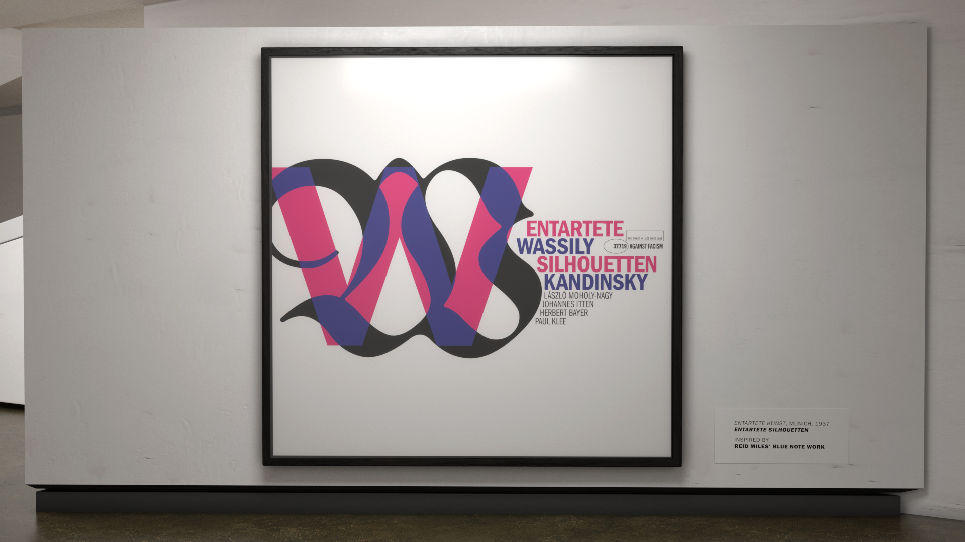
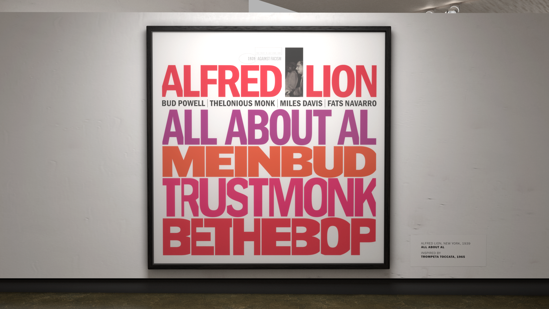
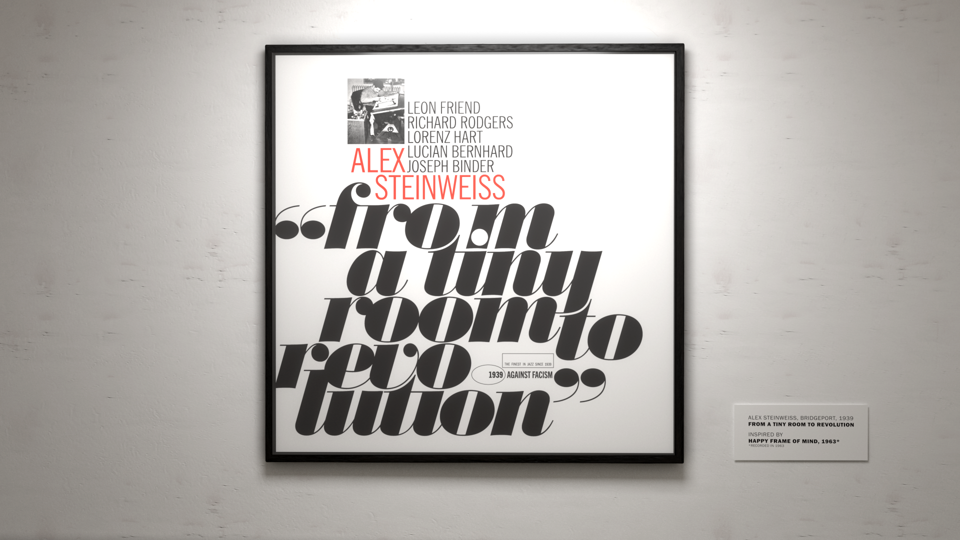
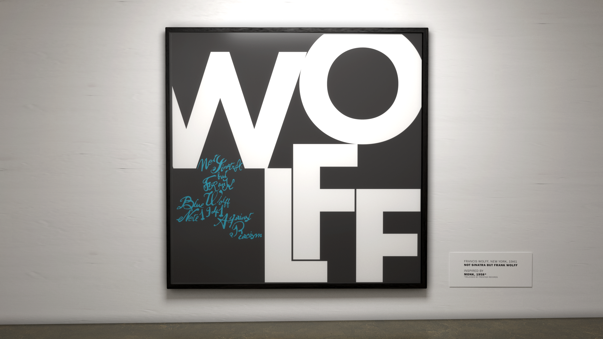
The investigation begins with the emergence of the German modern art school, the Bauhaus. In order to deepen the understanding of the effects of the Gropius school in the field of arts, a chronological line was drawn, which starts from the end of World War I and the subsequent rise of the Nazi Party. As a way to expose the studied events, a collection of seven graphic pieces based on Miles’ typographic language was elaborated. Each piece reveals an important milestone in the constructed narrative, followed by its respective main figure.
As a way of clarifying the developed concept, the graphic pieces were brought together in an exhibition, simulated through the digital three-dimensional reproduction of the Eric F. Ross Gallery of the Jüdisches Museum Berlin.