


Project Information
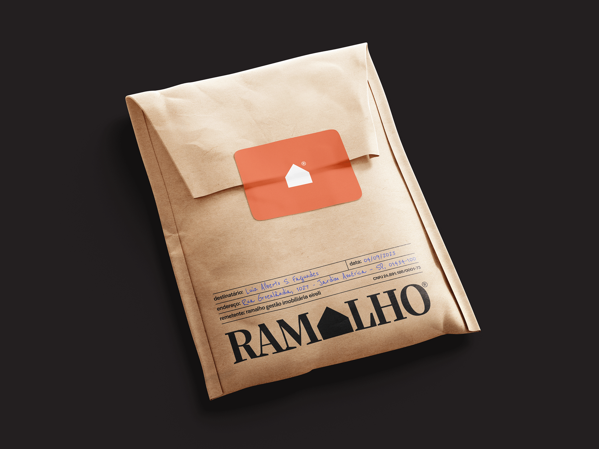
Ramalho's objective was to convey differentiation in a saturated market, clearly defining its positioning for the high-end real estate market. The brand sought to express seriousness, clarity, objectivity, practicality and, above all, refinement and aesthetic appeal, aligning itself with the clientele that hires its services. The company, called RAMALHO GESTÃO IMOBILIÁRIA LTDA, chose to use only the name “Ramalho” to emphasize the company's identity and implicitly show its competence, a common practice among luxury brands.
The project was designed to position Ramalho as more than just a management company, but as a solid link of trust where families with several properties could feel secure about the management of their assets. The service was discreet, reliable, elegant and cordial, with the aim of conveying an extremely solid image. The brand serves a high-end clientele, with multiple properties located in different regions of the country, where management is done in a uniform and highly standardized way to meet the needs of each client.
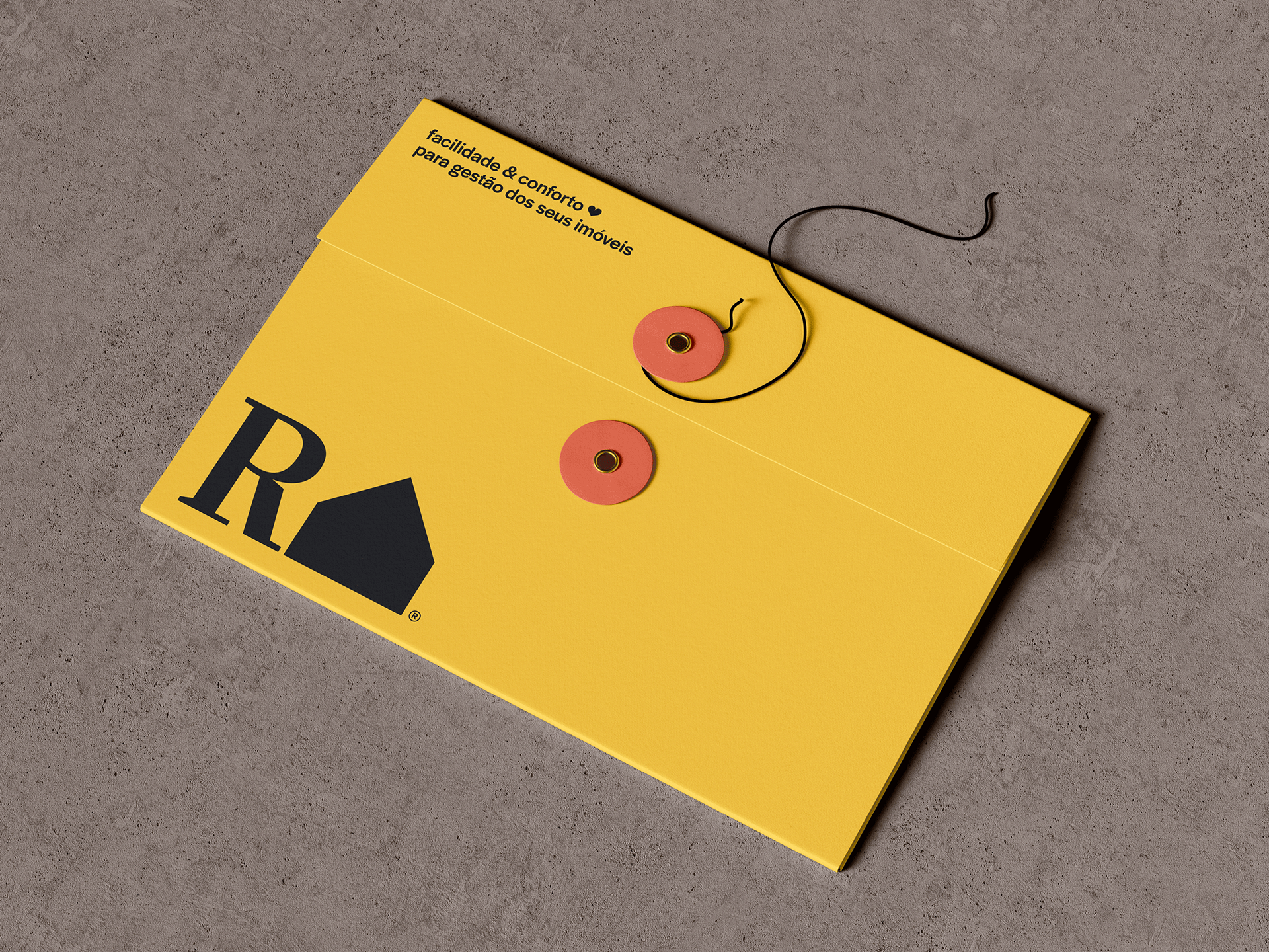
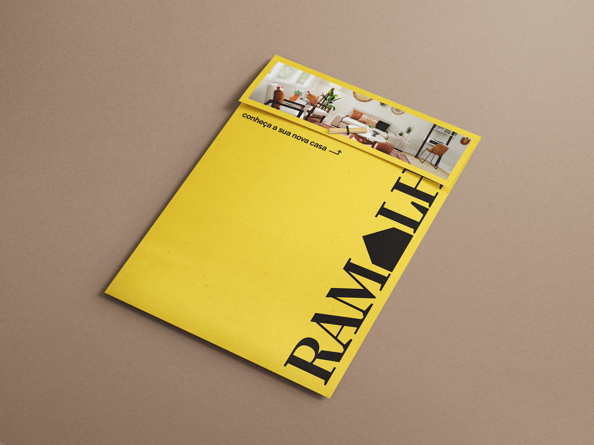
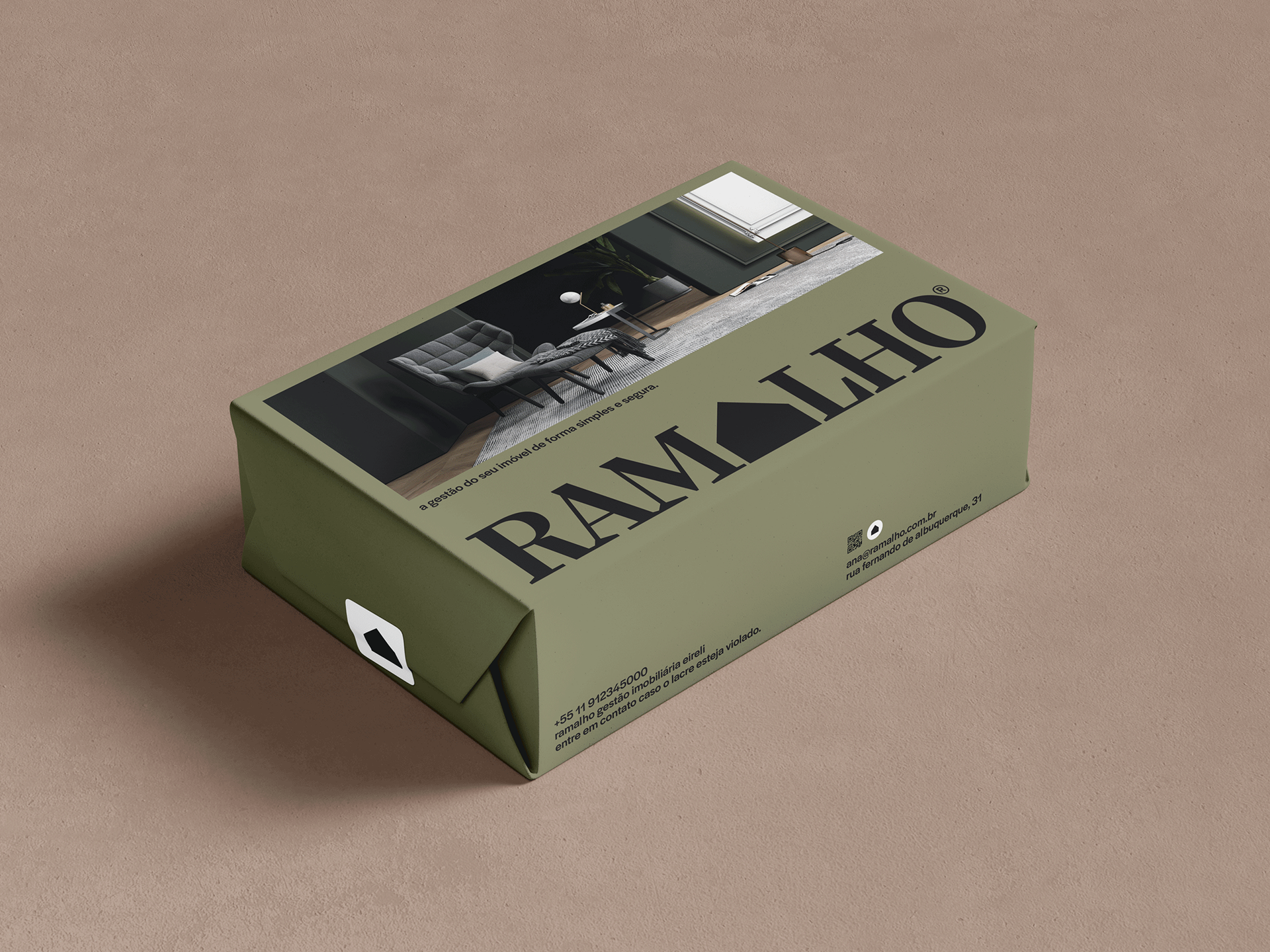
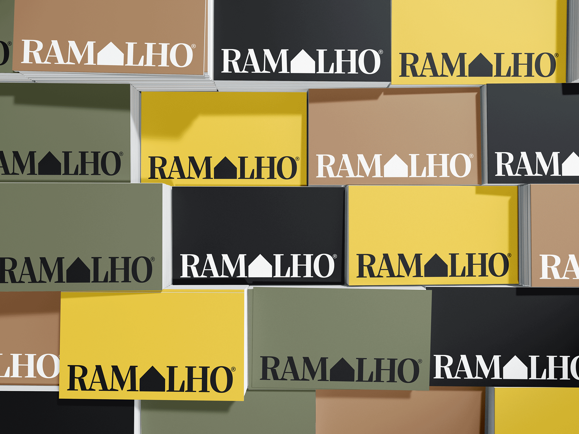
In the logo, the “A” of “Ramalho” was replaced by a house symbol, centralizing the design with three letters (RAM) before the symbol and three letters (LHO) after, ensuring uniformity and aesthetic balance and placing the house/residence at the center of the brand. The color palette was composed of earth tones, moss green and vibrant yellow, along with wood textures, chosen to convey seriousness, sophistication and a solid stance. The emphasis on the Ramalho name is intended to reflect the positioning of a company that has been run by the same family for three generations, highlighting its efficiency and successful attitude, proven by the portfolio of loyal customers over the years.
Credits
Creative Direction, Design, Strategy:
Enzo Graziano
Fonts
Silva Display - Blackletra Type Foundry
Halyard - Darden Studio