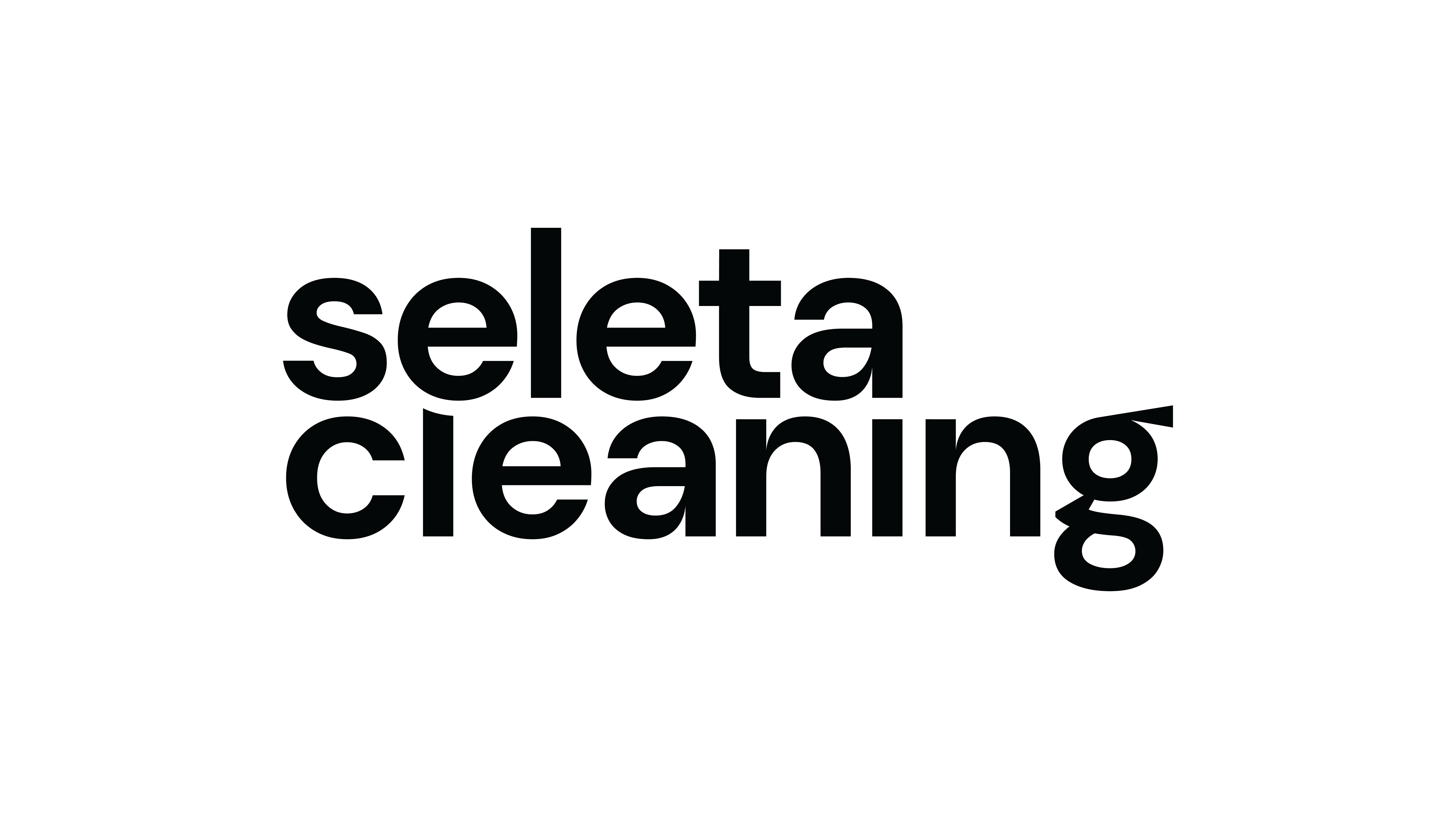
The main focus of the project was to develop a unique identity for the type of area in which the company operates. As a result, the logo was created to avoided the outdated cliches of broom iconography or the female figure as a symbol of domestic cleanliness.
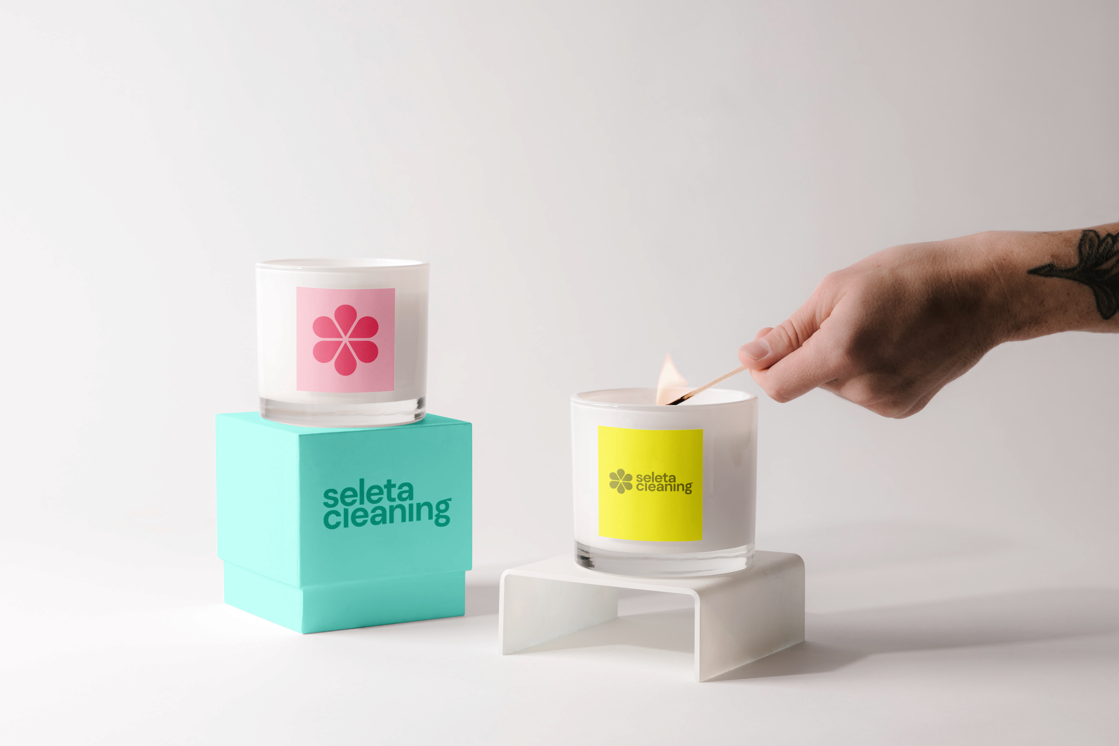
The idea was to develop a simple and striking symbol for quick identification, combined with the synthesis of the primary elements that Seleta uses in their work, such as water, floral scents and standardization of service.
Another important point was the need to develop a simple form that was malleable and adaptable to any palette and surface, due to the possible launch of new products and services.


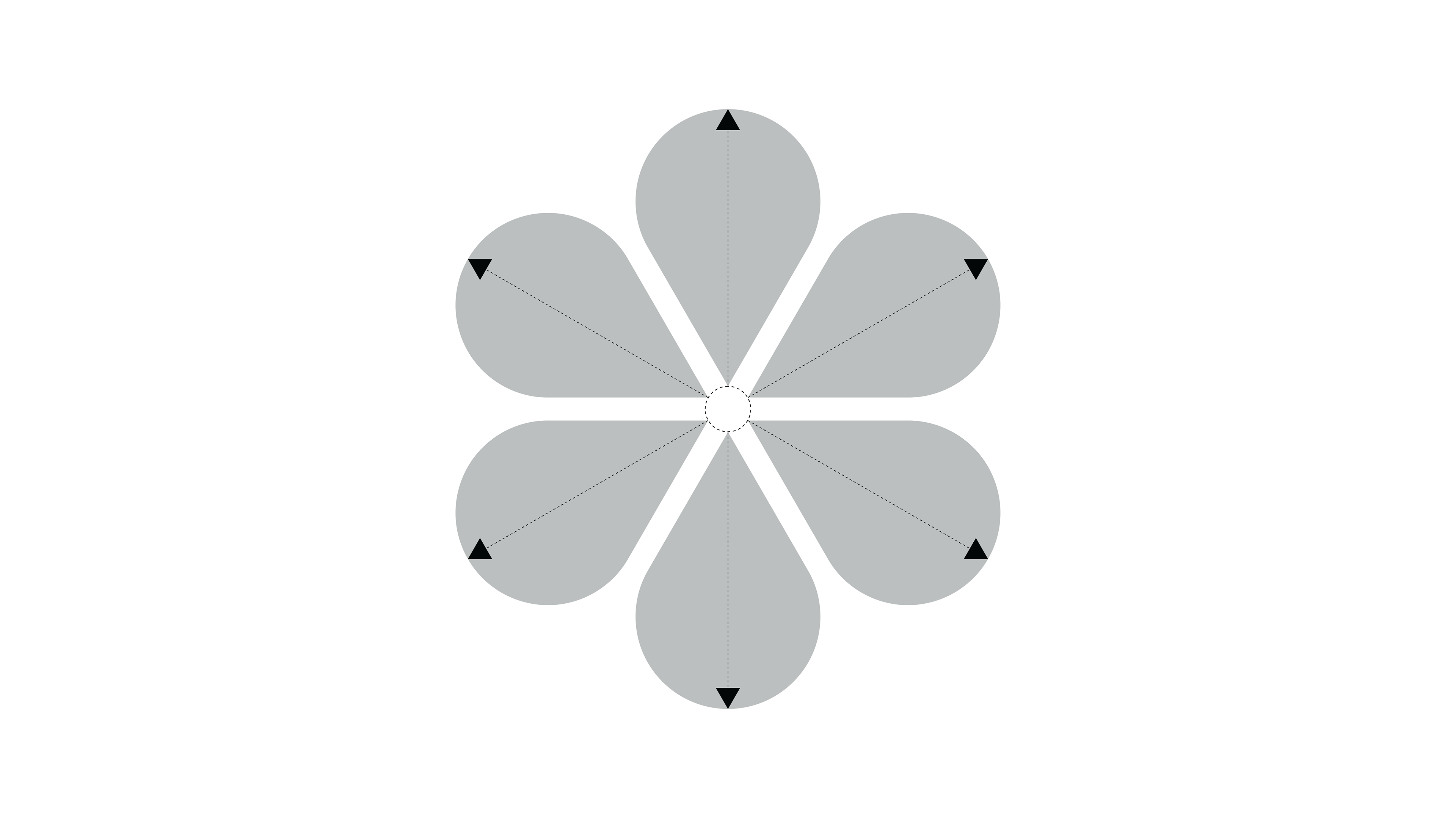
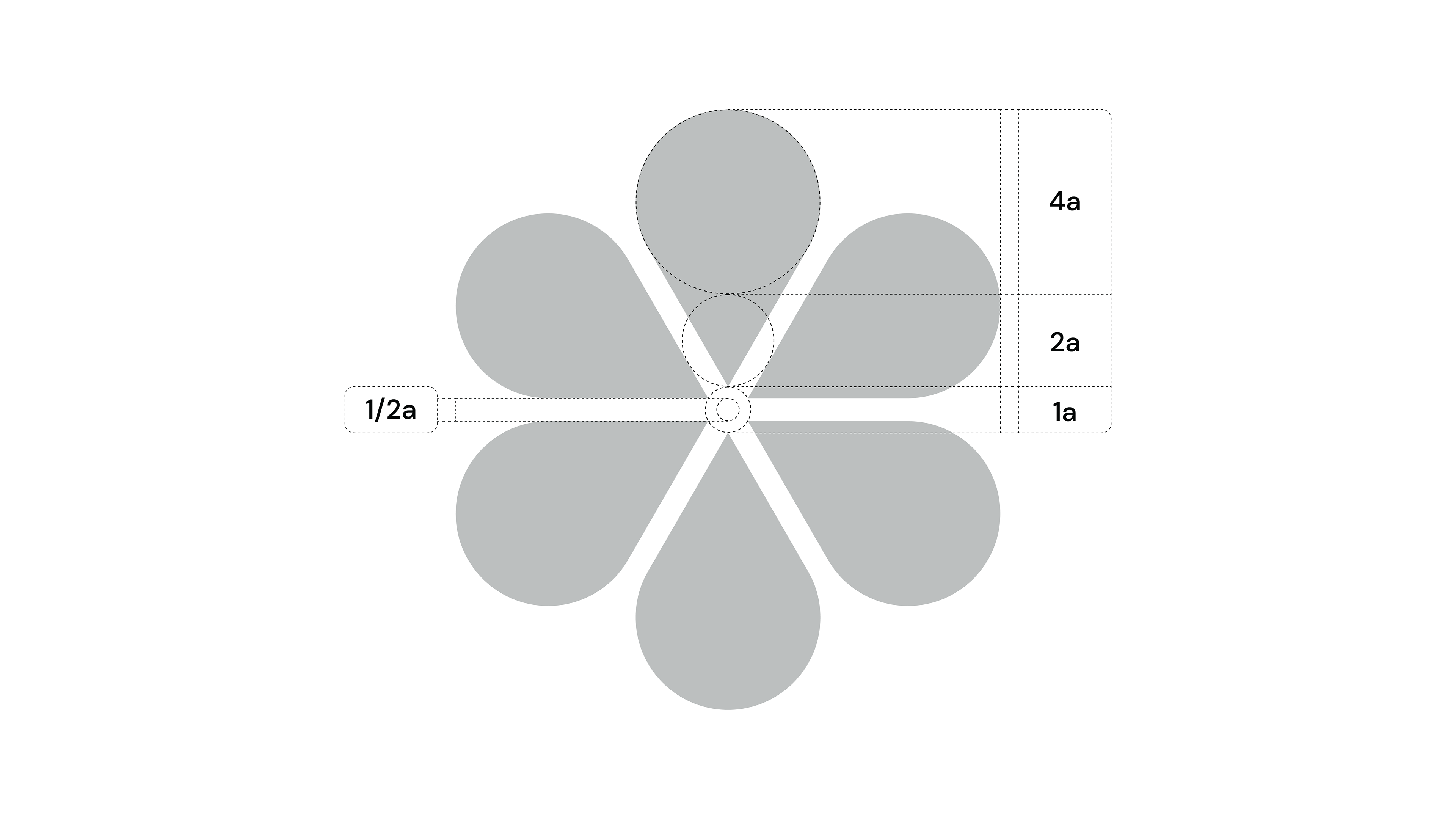
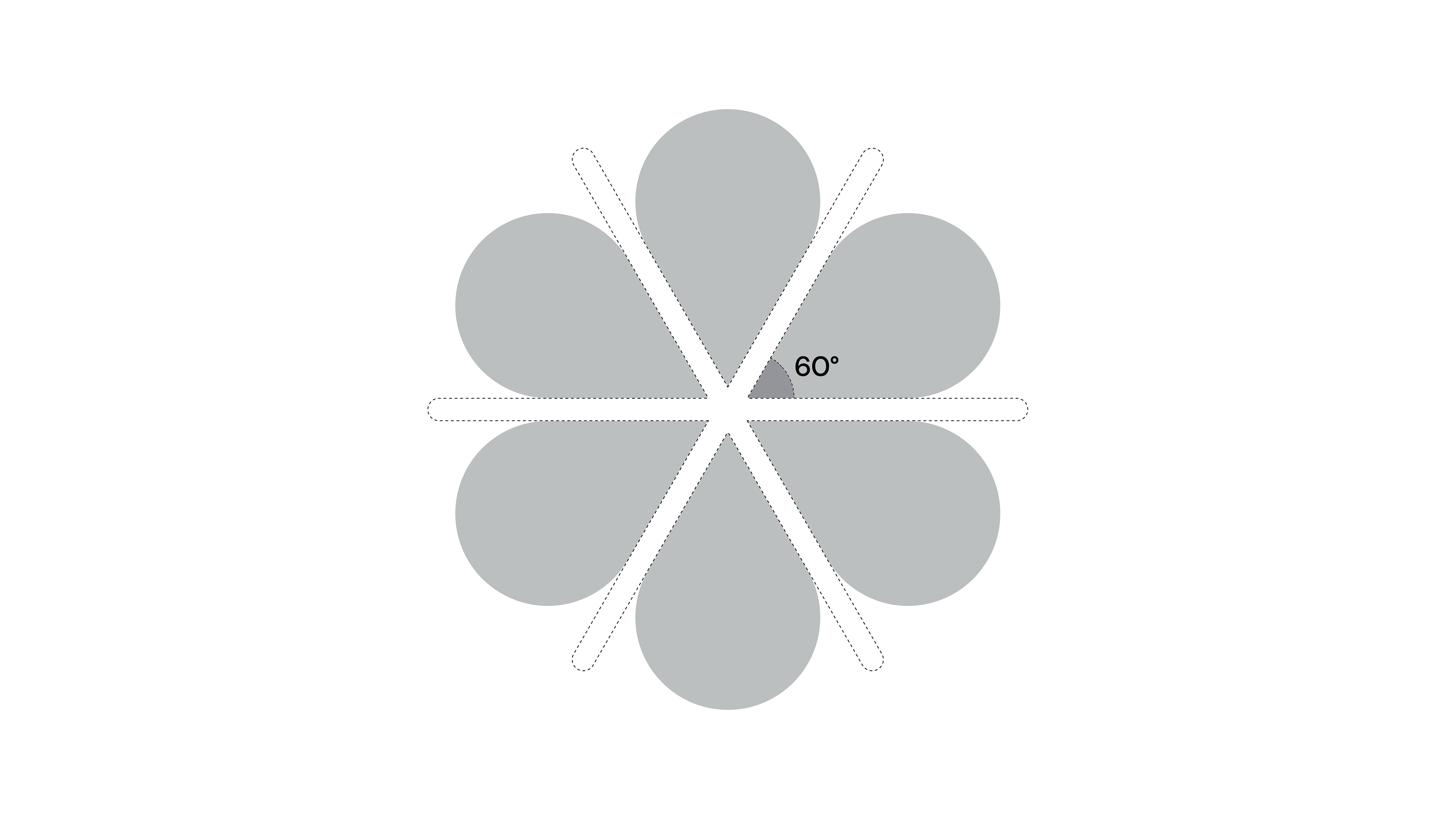
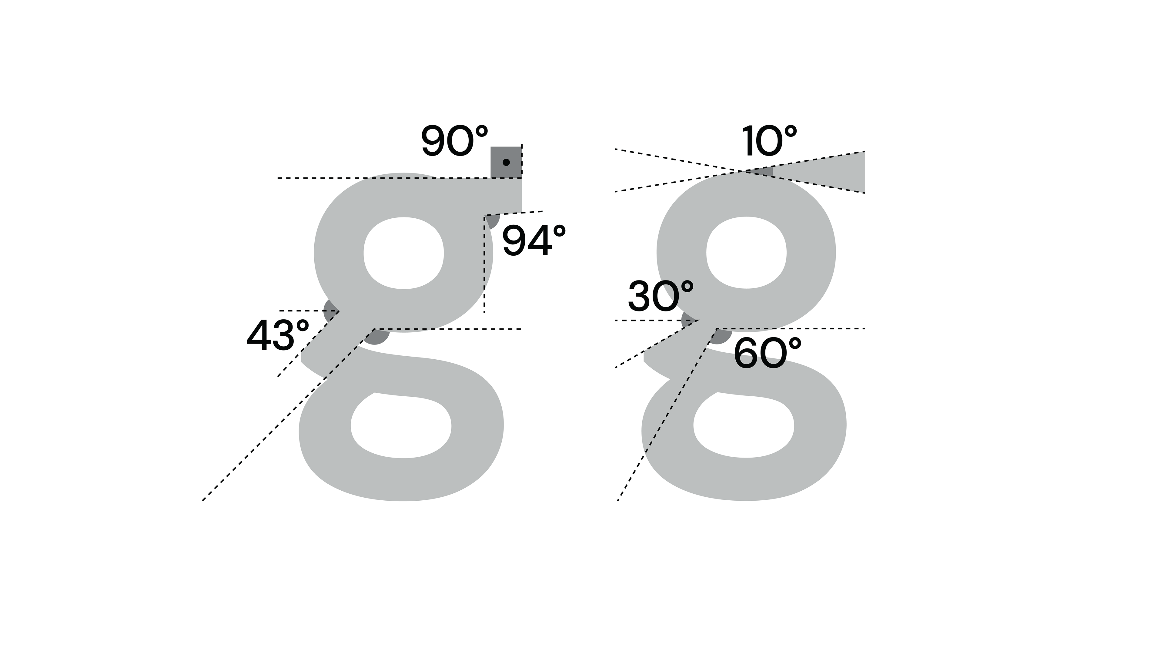
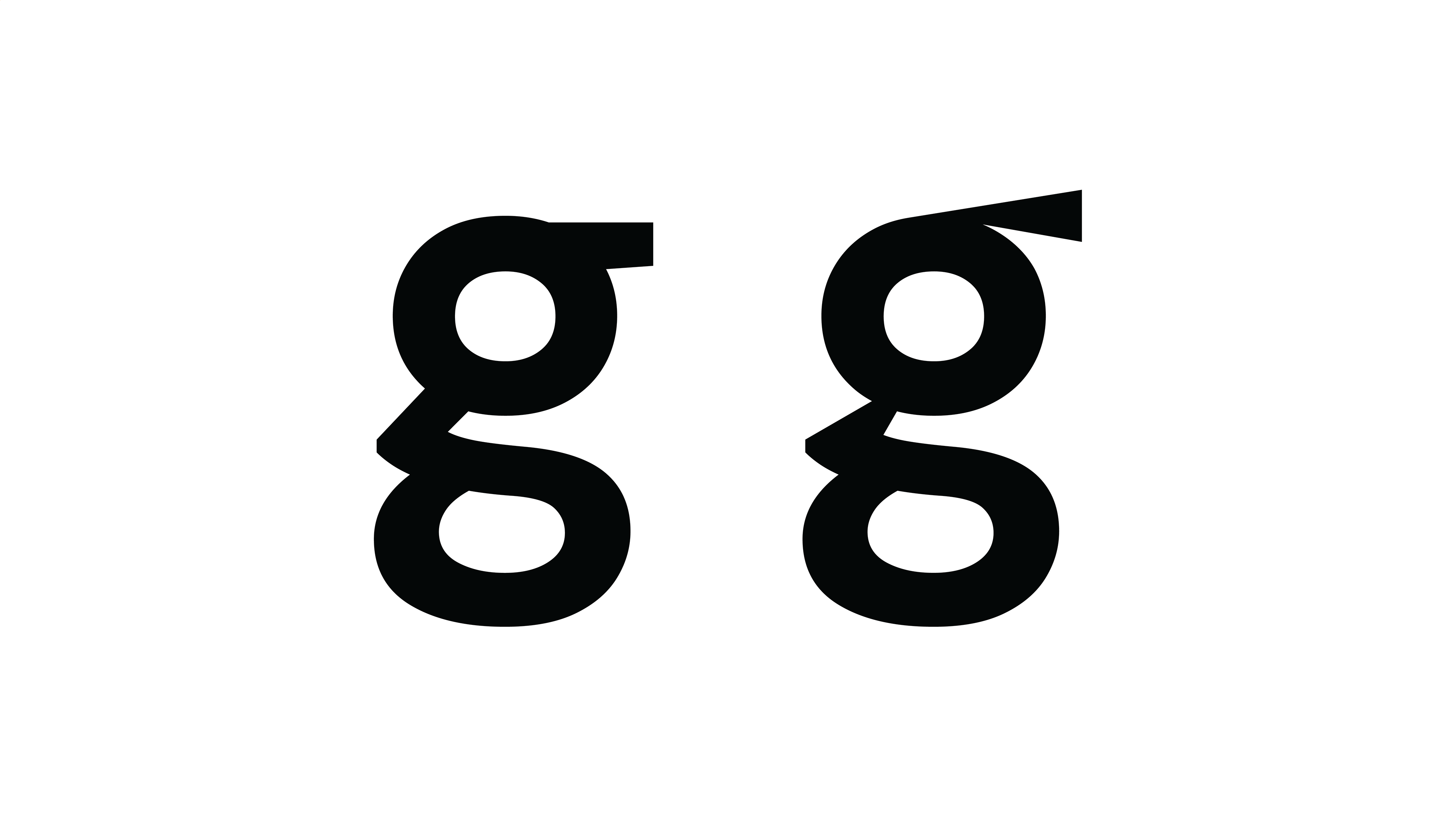
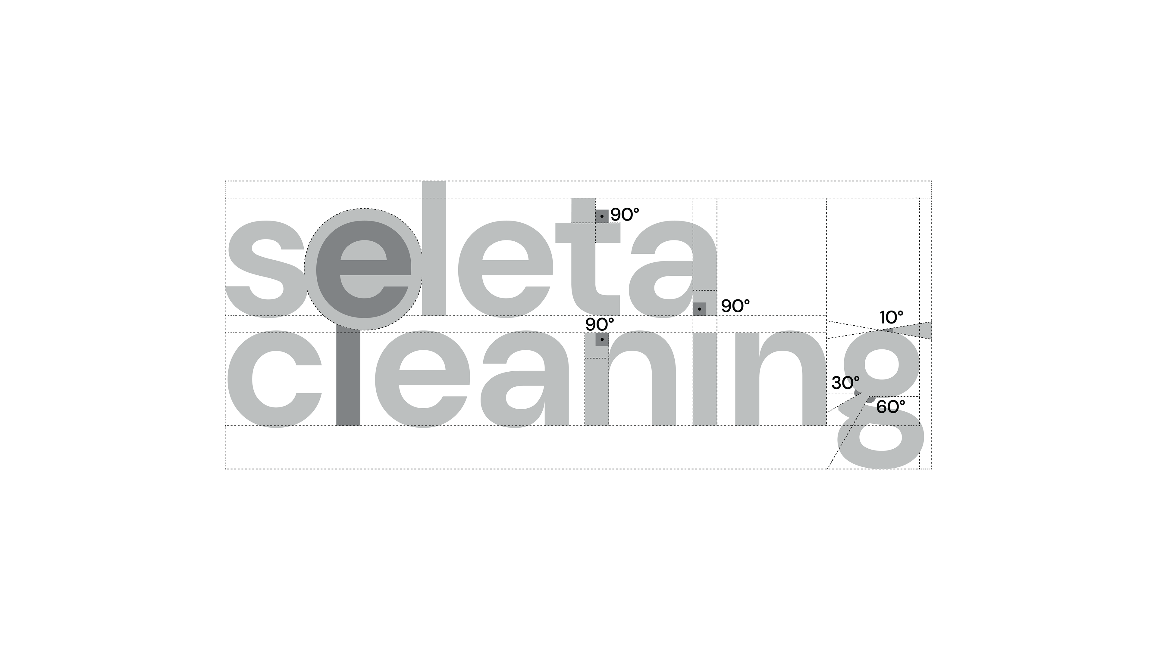
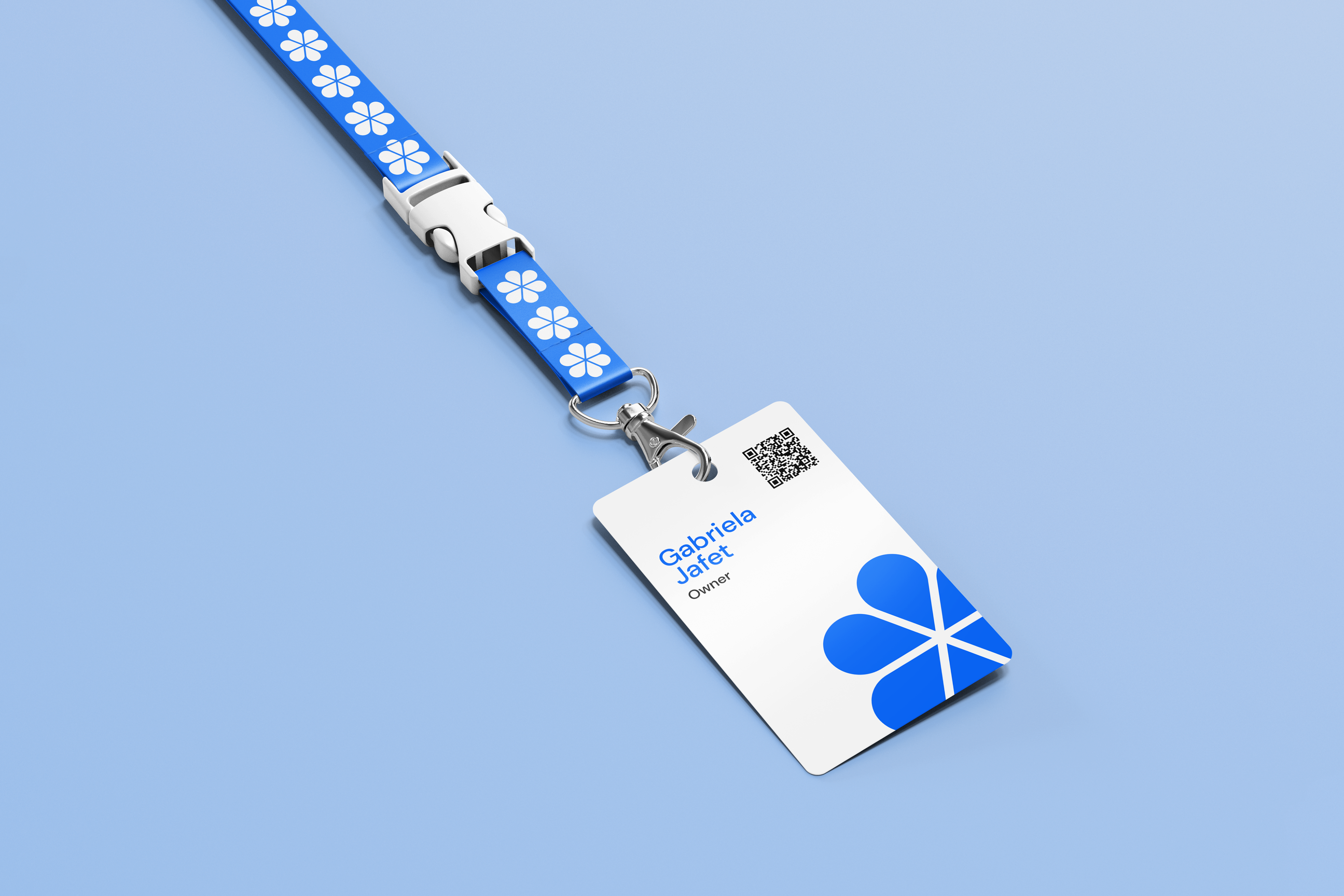
The logo construction structure respects a symmetrical pattern from the same angle. All spacings follow the same proportion as well as the uniformity and consistency of the service that Seleta offers.
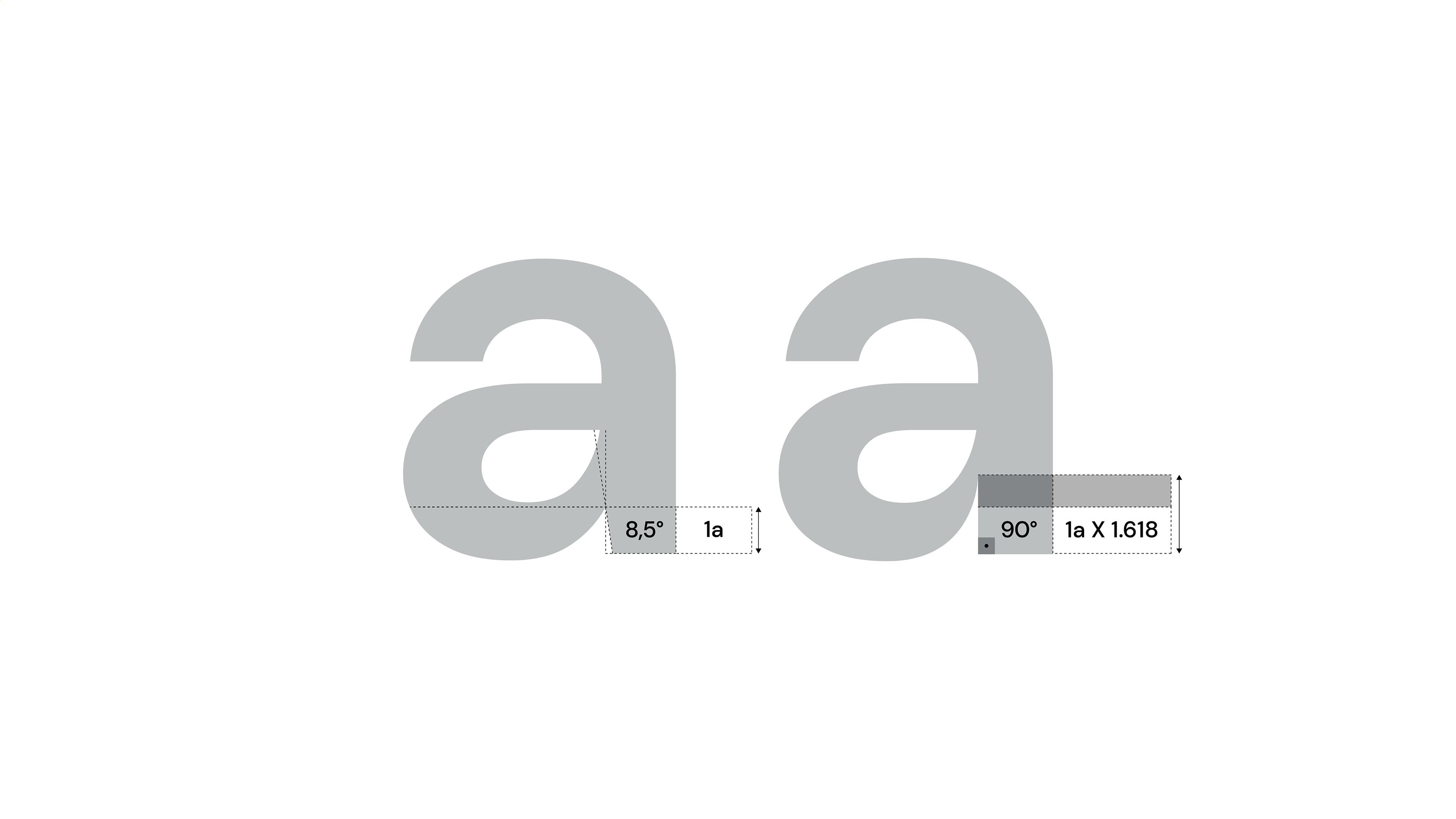
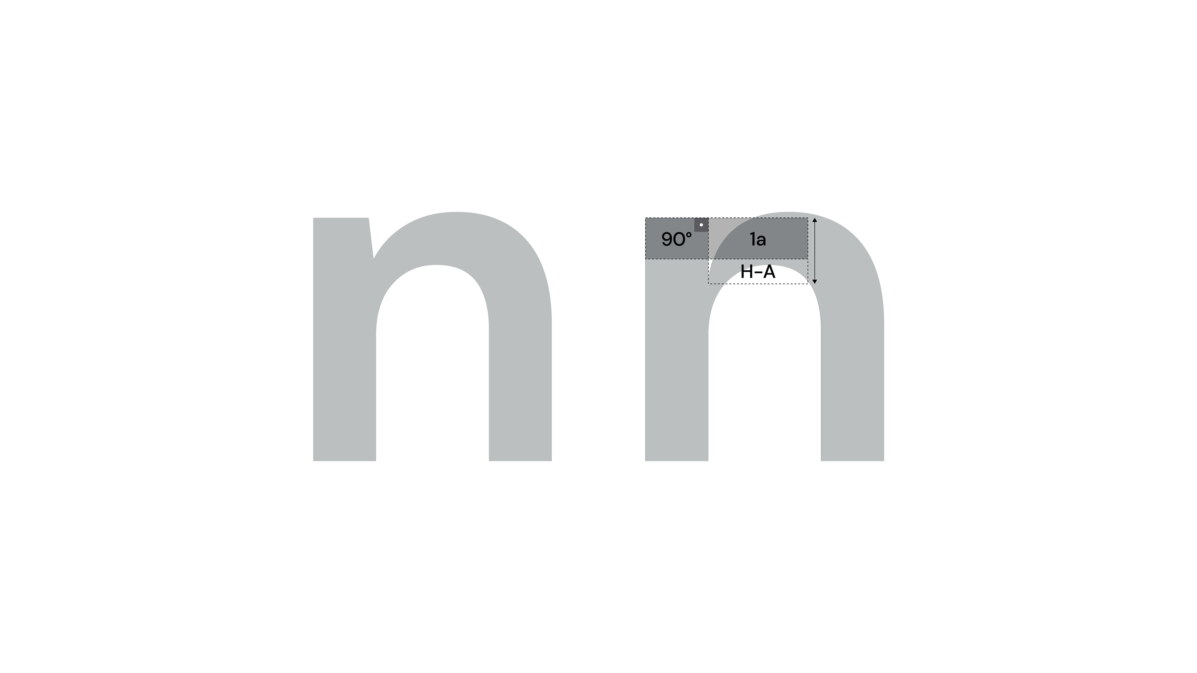
Some adjustments to the typographic anatomy of the logo lettering were carried out in order to establish an unique identity.


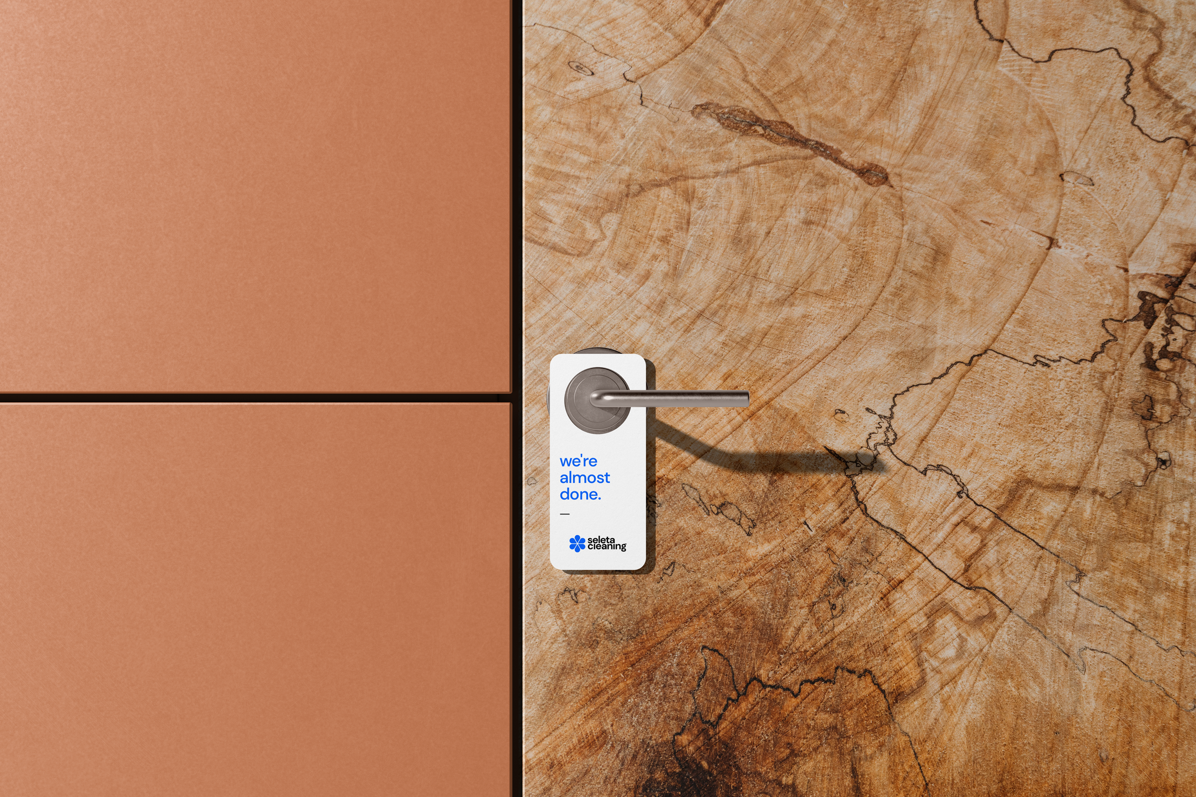


The project was developed aiming at the main demand of the company, the domestic cleaning service. However, Seleta intends to expand in the future to the field of cleaning school, hospital and industrial environments.